Здравейте! Вероятно използвате блокиращ рекламите софтуер. В това няма нищо нередно, много хора го правят. |
Но за да помогнете този сайт да съществува и за да имате достъп до цялото съдържание, моля, изключете блокирането на рекламите. |
| Ако не знаете как, кликнете тук |
Вашият десктоп
 Всичко свързано с Линукс. Новини, проблеми, въпроси.
Десктоп Линукс дистибуции, сървърни Линукс дистрибуции, Линукс дистрибуции с общо предназначение, Linux Mint, Ubuntu, Arch Linux, Mandriva, PCLinuxOS, openSUSE, Fedora, Red Hat Enterprise Linux, CentOS, Suse Linux Enterprise Server, Debian, Cross Linux from Scratch, Slackware, Gentoo. Графични среди, новини, игри, драйвъри, въпроси, десктоп, сървър, браузъри, помощ.


-
Mozo

- Skynet Cyber Unit

- Мнения: 296703
- Регистриран: пет юни 01, 2007 14:18
- Репутация: 368092
- Местоположение: Somewhere In Time
Re: Вашият десктоп
Най-доброто е според нуждите. Но пък няма как да изградиш навици с нещо, което не използваш. И като ми каже някой - ама това не ми липсва. Ами нормално, ти никога не си го ползвал. Същото като Windows потребителите, които ми обясняват кооолко хубаво им било на Windows. Доообре 


-
fifi_fifito

- Дарител

- Мнения: 3375
- Регистриран: пон фев 10, 2014 10:17
- Репутация: 18661
- пол: Мъж
- Местоположение: Търговище


Re: Вашият десктоп
Темата е Adara Dark избрах я защото е леко прозрачна и я редактирах!Ще ти кача редактирания файл защото не помня всичките неща които пипах! Това cinnamon.css който е в папката cinnamon на темата ! Заменяш го с моя даваш alt+F2 след това натискаш r да се презареди темата и е готово!
spoiler:
Код: Избери всички
@charset "UTF-8";
/*
 * Adara theme for Cinnamon
 * Copyright (C) 2018 Germán Franco <dev.germanfr@gmail.com>
 *
 * This program is free software: you can redistribute it and/or modify
 * it under the terms of the GNU General Public License as published by
 * the Free Software Foundation, either version 3 of the License, or
 * (at your option) any later version.
 *
 * This program is distributed in the hope that it will be useful,
 * but WITHOUT ANY WARRANTY; without even the implied warranty of
 * MERCHANTABILITY or FITNESS FOR A PARTICULAR PURPOSE.  See the
 * GNU General Public License for more details.
 *
 * You should have received a copy of the GNU General Public License
 * along with this program.  If not, see <https://www.gnu.org/licenses/>.
 */
/* ======================================
 * ! Font
 * ====================================== */
stage {
  font-family: Ubuntu, Roboto, Cantarell;
  font-size: 100%;
}

.cinnamon-link {
  color: #1481b8;
  font-weight: normal;
  text-decoration: none;
}

.cinnamon-link:hover {
  color: #1481b8;
  text-decoration: underline;
}

StIcon {
  warning-color: #ebbc00;
  error-color: #ff2525;
  success-color: #1481b8;
}

/* ======================================
 * ! Tooltips
 * ====================================== */
#Tooltip {
  border-radius: 3px;
  color: rgba(255, 255, 255, 0.95);
  border: 1px solid rgba(0, 0, 0, 0.6);
  background-color: #1f1f1f;
  padding: 4px 8px;
  font-size: 100%;
  font-weight: normal;
  text-align: center;
  spacing: 6px;
}

/* ======================================
 * ! Tile Previews
 * ====================================== */
.tile-preview, .tile-hud {
  border: 1px #297aa3;
  background-color: rgba(41, 122, 163, 0.6);
}

.tile-preview.snap, .tile-hud.snap {
  border: 1px #29a329;
  background-color: rgba(41, 163, 41, 0.6);
}

/* ======================================
 * ! Scrollbars
 * ====================================== */
StScrollView.vfade {
  -st-vfade-offset: 4em;
}

StScrollView.hfade {
  -st-hfade-offset: 4em;
}

StScrollBar {
  padding: 0;
  min-width: 12px;
  min-height: 12px;
}

StScrollBar StBin#trough {
  border-image: url("img/controls/scroll-trough.svg") 6;
}

StScrollBar StButton#vhandle,
StScrollBar StButton#hhandle {
  background:  rgba(0, 0, 0, 0.25);
  border: 1px rgba(0, 0, 0, 0.6);
  border-radius: 6px;
}

StScrollBar StButton#vhandle:hover, StScrollBar StButton#vhandle:focus, StScrollBar StButton#vhandle:active,
StScrollBar StButton#hhandle:hover,
StScrollBar StButton#hhandle:focus,
StScrollBar StButton#hhandle:active {
  background:  rgba(0, 0, 0, 0.25);
  border: 1px rgba(0, 0, 0, 0.35);
}

/* ======================================
 * ! Entries
 * ====================================== */
StEntry,
.menu StEntry,
.modal-dialog StEntry,
#notification StEntry {
  border-radius: 3px;
  color: rgba(255, 255, 255, 0.95);
  border: 1px solid rgba(0, 0, 0, 0.6);
  background-color:rgba(0,0,0,0.32);
  color: rgba(255, 255, 255, 0.75);
  padding: 6px;
  width: 16em;
  height: 1.1em;
  font-size: 100%;
  font-weight: normal;
}

StEntry:focus, StEntry:active, StEntry:pressed,
.menu StEntry:focus,
.menu StEntry:active,
.menu StEntry:pressed,
.modal-dialog StEntry:focus,
.modal-dialog StEntry:active,
.modal-dialog StEntry:pressed,
#notification StEntry:focus,
#notification StEntry:active,
#notification StEntry:pressed {
  color: rgba(255, 255, 255, 0.95);
  caret-color: rgba(255, 255, 255, 0.95);
  caret-size: 1px;
  selected-color: rgba(255, 255, 255, 0.85);
  selection-background-color: #999;
}

StEntry StIcon,
.menu StEntry StIcon,
.modal-dialog StEntry StIcon,
#notification StEntry StIcon {
  color: rgba(255, 255, 255, 0.75);
  icon-size: 16px;
}

StEntry:focus > StIcon,
StEntry:active > StIcon,
StEntry:pressed > StIcon,
.menu StEntry:focus > StIcon,
.menu StEntry:active > StIcon,
.menu StEntry:pressed > StIcon,
.modal-dialog StEntry:focus > StIcon,
.modal-dialog StEntry:active > StIcon,
.modal-dialog StEntry:pressed > StIcon,
#notification StEntry:focus > StIcon,
#notification StEntry:active > StIcon,
#notification StEntry:pressed > StIcon {
  color: rgba(255, 255, 255, 0.95);
}

/* ======================================
 * ! Switchers
 * ====================================== */
.toggle-switch, .toggle-switch-us, .toggle-switch-intl {
  width: 30px;
  height: 16px;
  background-image: url("img/controls/switch.svg");
  background-position: 0px 0px;
  background-color: rgba(153, 153, 153, 0.35);
  border-radius: 8px;
}

.toggle-switch:checked, .toggle-switch-us:checked, .toggle-switch-intl:checked {
  background-color: #999;
  background-position: 14px 0px;
}

/* ======================================
 * ! Checkboxes + Radio buttons
 * ====================================== */
.check-box CinnamonGenericContainer {
  spacing: .2em;
  min-height: 17px;
}

.check-box StBin {
  width: 17px;
  height: 17px;
  background-image: url("img/controls/check-box.svg");
}

.check-box:focus StBin {
  background-image: url("img/controls/check-box-focused.svg");
}

.check-box:checked StBin {
  background-image: url("img/controls/check-box-checked.svg");
}

.check-box:focus:checked {
  background-image: url("img/controls/check-box-checked-focused.svg");
}

.radiobutton CinnamonGenericContainer {
  spacing: .2em;
  min-height: 17px;
}

.radiobutton StBin {
  width: 17px;
  height: 17px;
  background-image: url("img/controls/radiobutton.svg");
}

.radiobutton:focus StBin {
  background-image: url("img/controls/radiobutton-focused.svg");
}

.radiobutton:checked StBin {
  background-image: url("img/controls/radiobutton-checked.svg");
}

.radiobutton:focus:checked {
  background-image: url("img/controls/radiobutton-checked-focused.svg");
}

/* ======================================
 * ! Button (global selector)
 * ====================================== */
.button {
  background-color: transparent;
  background-gradient-direction: none;
  background-gradient-start: transparent;
  background-gradient-end: transparent;
  box-shadow: 0 0 transparent;
  border: none;
  border-width: 0;
  border-radius: 0;
  font-size: 100%;
  border-image: url("img/buttons/button-primary__s.svg") 8;
  color: rgba(255, 255, 255, 0.95);
  font-weight: normal;
  padding: 8px 16px;
}

.button StIcon {
  icon-size: 16px !important;
}

.button StIcon {
  color: rgba(255, 255, 255, 0.95);
}

.button:hover {
  border-image: url("img/buttons/button-primary__s--hover.svg") 8;
  color: rgba(255, 255, 255, 0.95);
}

.button:hover StIcon {
  color: rgba(255, 255, 255, 0.95);
}

.button:active, .button:pressed, .button:activate, .button:checked, .button:selected {
  border-image: url("img/buttons/button-primary__s--pressed.svg") 8;
  color: rgba(255, 255, 255, 0.95);
}

.button:active StIcon, .button:pressed StIcon, .button:activate StIcon, .button:checked StIcon, .button:selected StIcon {
  color: rgba(255, 255, 255, 0.95);
}

.button:focus {
  border-image: url("img/buttons/button-selected__s.svg") 8;
  color: rgba(255, 255, 255, 0.95);
}

.button:focus StIcon {
  color: rgba(255, 255, 255, 0.95);
}

.button:focus:hover {
  border-image: url("img/buttons/button-selected__s--hover.svg") 8;
}

.button:focus:active, .button:focus:pressed, .button:focus:activate, .button:focus:checked, .button:focus:selected {
  border-image: url("img/buttons/button-selected__s--pressed.svg") 8;
  color: rgba(255, 255, 255, 0.95);
}

.button:focus:active StIcon, .button:focus:pressed StIcon, .button:focus:activate StIcon, .button:focus:checked StIcon, .button:focus:selected StIcon {
  color: rgba(255, 255, 255, 0.95);
}

.button:grayed, .button:disabled, .button:insensitive, .button:focus:grayed, .button:focus:disabled, .button:focus:insensitive {
  border-image: url("img/buttons/button-primary__s.svg") 8;
  color: rgba(255, 255, 255, 0.25);
}

.button:grayed StIcon, .button:disabled StIcon, .button:insensitive StIcon, .button:focus:grayed StIcon, .button:focus:disabled StIcon, .button:focus:insensitive StIcon {
  color: rgba(255, 255, 255, 0.25);
}

/* ======================================
 * ! Slider
 * ====================================== */
.slider, .popup-slider-menu-item {
  height: 14px;
 height: 14px;
  min-width: 12em;
  -slider-height: 4px;
  -slider-border-width: 0px;
  /* Active part */
  -slider-background-color: rgba(0, 0, 0, 0.25);
  -slider-border-color: transparent;
  /* Background part */
  -slider-active-background-color:rgba(0,0,0,0.25);
  -slider-active-border-color: transparent;
  /* Handle */
  -slider-handle-radius: 6px;
  color:rgba(0,0,0,0.25);
}

/* ======================================
 * ! Popup Menus
 * ====================================== */
.menu {
 border-radius: 3px;
  color:  #fff;
  border: 1px solid rgba(0, 0, 0, 0.45);
  background-color:rgba(0,0,0,0.32);
  box-shadow: 0 2px 6px rgba(0, 0, 0, 0.25);
  margin: 6px
}

.popup-menu-content {
  color: rgba(255, 255, 255, 0.95);
  padding: 3px 0;
  min-width: 11em;
  font-size: 100%;
}

.popup-menu-icon {
  icon-size: 16px;
  color: rgba(255, 255, 255, 0.75);
}

.popup-menu-arrow {
  icon-size: 1.05em;
  width: 1.05em;
  height: 1.05em;
  color: rgba(255, 255, 255, 0.95);
}

.popup-menu-item {
  padding: 6px 10px;
  spacing: 8px;
}

.popup-menu-item:active {
  background-color: rgba(255, 255, 255, 0.1);
}

.popup-menu-item:insensitive {
  font-weight: normal;
  color: rgba(255, 255, 255, 0.25);
}

.popup-menu-item:insensitive .popup-menu-icon, .popup-menu-item:insensitive StIcon {
  color: rgba(255, 255, 255, 0.25);
}

.popup-menu-item-dot {
  color: #999;
}

.popup-sub-menu {
  border-radius: 3px;
  color: rgba(255, 255, 255, 0.95);
  border: 1px solid rgba(0, 0, 0, 0.35);
  background-color: #090909;
  border-right-width: 0;
  border-left-width: 0;
  border-radius: 0;
  padding: 3px 0;
}

.popup-separator-menu-item {
  height: 1px;
  padding: 0;
  background-color: rgba(0, 0, 0, 0.45);
  margin: 6px 10px;
}

.popup-menu-item > .popup-separator-menu-item {
  /* Cinnamon < 4.0 */
  margin: 0;
  -gradient-height: 1px;
  -gradient-start: transparent;
  -gradient-end: transparent;
  -margin-horizontal: 0;
}

/* Right click in scale (show all windows) */
.popup-combo-menu {
  border-radius: 3px;
  color: rgba(255, 255, 255, 0.95);
  border: 1px solid rgba(0, 0, 0, 0.45);
  background-color: #111111;
  box-shadow: 0 2px 6px rgba(0, 0, 0, 0.25);
}

.popup-combo-menu .popup-menu-item:active {
  background-color: rgba(255, 255, 255, 0.1);
}

.popup-inactive-menu-item {
  color: rgba(255, 255, 255, 0.25);
}

.popup-subtitle-menu-item {
  font-weight: bold;
}

/* used in power applet */
.popup-device-menu-item {
  spacing: 8px;
}

.popup-device-menu-item .popup-inactive-menu-item {
  color: #1481b8;
}

/* ======================================
 * ! Panel
 * ====================================== */
.panel-top {
 font-size: 100%;
  width: 43px;
  height: 33px;
  background-color: rgba(0, 0, 0, 0.35);
  border-bottom-width: 1px;
  border-color: rgba(0, 0, 0, 0.25);
  /* When panel settings is open */
  /* Panel edit mode */
}

.panel-top:highlight .panelLeft, .panel-top:highlight .panelCenter, .panel-top:highlight .panelRight {
  background-gradient-direction: vertical;
  background-gradient-start: transparent;
  background-gradient-end: rgba(255, 204, 0, 0.25);
}

.panel-top .panelLeft:dnd,
.panel-top .panelRight:dnd {
  background-gradient-direction: vertical;
  background-gradient-start: transparent;
  background-gradient-end: rgba(255, 204, 0, 0.25);
}

.panel-top .panelCenter:dnd {
  background-gradient-direction: vertical;
  background-gradient-start: transparent;
  background-gradient-end: rgba(51, 153, 204, 0.25);
}

.panel-bottom {
  font-size: 100%;
  width: 43px;
  height: 33px;
  background-color: rgba(0, 0, 0, 0.45);
  border-top-width: 1px;
  border-color: rgba(0, 0, 0, 0.25);
  /* When panel settings is open */
  /* Panel edit mode */
}

.panel-bottom:highlight .panelLeft, .panel-bottom:highlight .panelCenter, .panel-bottom:highlight .panelRight {
  background-gradient-direction: vertical;
  background-gradient-start: rgba(255, 204, 0, 0.25);
  background-gradient-end: transparent;
}

.panel-bottom .panelLeft:dnd,
.panel-bottom .panelRight:dnd {
  background-gradient-direction: vertical;
  background-gradient-start: rgba(255, 204, 0, 0.25);
  background-gradient-end: transparent;
}

.panel-bottom .panelCenter:dnd {
  background-gradient-direction: vertical;
  background-gradient-start: rgba(51, 153, 204, 0.25);
  background-gradient-end: transparent;
}

.panel-left {
  font-size: 100%;
  width: 43px;
  height: 33px;
  background-color: rgba(0, 0, 0, 0.85);
  border-right-width: 1px;
  border-color: rgba(0, 0, 0, 0.25);
  /* When panel settings is open */
  /* Panel edit mode */
}

.panel-left:highlight .panelLeft, .panel-left:highlight .panelCenter, .panel-left:highlight .panelRight {
  background-gradient-direction: horizontal;
  background-gradient-start: transparent;
  background-gradient-end: rgba(255, 204, 0, 0.25);
}

.panel-left .panelLeft:dnd,
.panel-left .panelRight:dnd {
  background-gradient-direction: horizontal;
  background-gradient-start: transparent;
  background-gradient-end: rgba(255, 204, 0, 0.25);
}

.panel-left .panelCenter:dnd {
  background-gradient-direction: horizontal;
  background-gradient-start: transparent;
  background-gradient-end: rgba(51, 153, 204, 0.25);
}

.panel-right {
  font-size: 100%;
  width: 43px;
  height: 33px;
  background-color: rgba(0, 0, 0, 0.85);
  border-left-width: 1px;
  border-color: rgba(0, 0, 0, 0.25);
  /* When panel settings is open */
  /* Panel edit mode */
}

.panel-right:highlight .panelLeft, .panel-right:highlight .panelCenter, .panel-right:highlight .panelRight {
  background-gradient-direction: horizontal;
  background-gradient-start: rgba(255, 204, 0, 0.25);
  background-gradient-end: transparent;
}

.panel-right .panelLeft:dnd,
.panel-right .panelRight:dnd {
  background-gradient-direction: horizontal;
  background-gradient-start: rgba(255, 204, 0, 0.25);
  background-gradient-end: transparent;
}

.panel-right .panelCenter:dnd {
  background-gradient-direction: horizontal;
  background-gradient-start: rgba(51, 153, 204, 0.25);
  background-gradient-end: transparent;
}

.panelLeft, .panelCenter, .panelRight {
  spacing: 1px;
}

/* Simulate panel spacing */
.panelCenter {
  padding: 0 1px;
}

.panelCenter.vertical {
  padding: 1px 0;
}

.panel-dummy {
  background-color: rgba(255, 204, 0, 0.5);
}

.panel-dummy:entered {
  background-color: rgba(51, 204, 51, 0.75);
}

/* ======================================
 * ! Expo view
 * ====================================== */
.expo-background {
  background-color: rgba(0, 0, 0, 0.9);
}

.expo-workspace-thumbnail-frame {
  border: 1px #000;
  box-shadow: 0px 0px 4px #000;
}

.workspace-thumbnails {
  /* Using other than 32px causes close buttons to look blurry */
  spacing: 32px;
}

/* This shades the workspace thumbnails */
.workspace-thumbnails .workspace-overview-background-shade {
  background-color: transparent;
}

.expo-workspaces-name-entry {
  padding: 6px;
  text-align: center;
}

.workspace-close-button, .window-close {
  background-image: url("img/controls/close.svg");
  background-size: 24px;
  width: 24px;
  height: 24px;
  -cinnamon-close-overlap: 12px;
}

.workspace-close-button:hover, .window-close:hover {
  background-image: url("img/controls/close-hover.svg");
}

.workspace-add-button {
  background-image: url("img/expo_scale/plus.svg");
  background-color: rgba(255, 255, 255, 0.1);
  border: 1px #000;
  border-radius: 3px;
  border-right: 0;
  height: 256px;
  width: 48px;
}

.workspace-add-button:hover {
  background-color: rgba(255, 255, 255, 0.15);
}

.window-close-area {
  background-image: url("img/expo_scale/trash.svg");
  background-color: rgba(255, 255, 255, 0.1);
  border: 1px #000;
  border-radius: 3px;
  border-bottom: 0;
  height: 64px;
  width: 512px;
}

/* ======================================
 * ! Windows overview
 * ====================================== */
/* The background for the scale view */
.workspace-overview-background-shade {
  background-color: rgba(0, 0, 0, 0.65);
}

.window-border {
  border: 4px rgba(255, 255, 255, 0.5);
  box-shadow: 0 0 0 1px rgba(255, 255, 255, 0.5) inset;
  border-radius: 3px;
  background-color: rgba(255, 255, 255, 0.05);
}

.window-caption {
  -cinnamon-caption-spacing: -16px;
  color: rgba(255, 255, 255, 0.85);
  font-size: 100%;
  font-weight: normal;
  max-width: 24em;
  spacing: 8px;
  padding: 8px;
  border-radius: 3px;
  color: rgba(255, 255, 255, 0.95);
  border: 1px solid rgba(0, 0, 0, 0.45);
  background-color: #111111;
  box-shadow: 0 2px 6px rgba(0, 0, 0, 0.25);
}

.window-close {
  -cinnamon-close-overlap: 11px;
}

.window-iconbox {
  /* Cinnamon < 4.0 */
  /* Compensate negative caption spacing overlap */
  padding-right: 26px;
}

.overview-empty-placeholder {
  color: rgba(255, 255, 255, 0.85);
  font-size: 200%;
}

/* ======================================
 * ! Applets
 * ====================================== */
/*
 * Fullcolor icons have the 'applet-icon' class.
 * Symbolic icons have the 'system-status-icon' class.
 */
.applet-icon,
.system-status-icon {
  icon-size: 16px;
  padding: 0;
  spacing: 0;
}

.applet-label {
  color: rgba(255, 255, 255, 0.85);
}

.panel-top .applet-separator, .panel-bottom .applet-separator {
  padding: 0 6px;
}

.panel-left .applet-separator, .panel-right .applet-separator {
  padding: 6px 0;
}

.applet-separator-line {
  background-color: rgba(0, 0, 0, 0.45);
  width: 1px;
}

.applet-separator-line-vertical {
  background-color: rgba(0, 0, 0, 0.45);
  height: 1px;
}

.applet-box {
  color: #d9d9d9;
  spacing: 4px;
  border-color: transparent;
  padding: 0 6px;
}

.applet-box.vertical {
  padding: 6px 0;
}

.panel-top .applet-box:hover, .panel-top .applet-box:checked, .panel-top .applet-box:highlight {
  border-top-width: 1px;
  padding-bottom: 1px;
}

.panel-bottom .applet-box:hover, .panel-bottom .applet-box:checked, .panel-bottom .applet-box:highlight {
  border-bottom-width: 1px;
  padding-top: 1px;
}

.panel-left .applet-box:hover, .panel-left .applet-box:checked, .panel-left .applet-box:highlight {
  border-left-width: 1px;
  padding-right: 1px;
}

.panel-right .applet-box:hover, .panel-right .applet-box:checked, .panel-right .applet-box:highlight {
  border-right-width: 1px;
  padding-left: 1px;
}

.applet-box:hover, .applet-box:checked {
  border-color: rgba(255, 255, 255, 0.85);
}

.applet-box:hover .applet-icon, .applet-box:checked .applet-icon {
  icon-shadow: 0 0 transparent;
}

.applet-box:checked {
  background-color: rgba(255, 255, 255, 0.15);
}

.applet-box:highlight {
  border-color: #ffcc00;
  background-color: rgba(255, 204, 0, 0.15);
}

/* ======================================
 * ! Calendar
 * ====================================== */
.datemenu-date-label {
  padding: 8px;
  padding-bottom: 0;
  text-align: center;
  color:rgba(255, 255, 255, 0.95);
  font-size: 110%;
}

.calendar {
  padding: 10px;
  padding-bottom: 6px;
  spacing-rows: 0;
  spacing-columns: 0px;
}

/* [<] Month [>] [<] Year [>] */
.calendar-month-label {
  padding: 3px 0;
  color: rgba(255, 255, 255, 0.95);
}

.calendar-change-month-back,
.calendar-change-month-forward {
  border-radius: 3px;
  color: rgba(255, 255, 255, 0.95);
  border: 1px solid rgba(0, 0, 0, 0.6);
  background-color: rgba(0, 0, 0, 0.45);
  width: 20px;
  height: 20px;
  background-size: 16px;
  margin: 0 3px;
}

.calendar-change-month-back:hover,
.calendar-change-month-forward:hover {
  border-radius: 3px;
  color: rgba(255, 255, 255, 0.95);
  border: 1px solid rgba(0, 0, 0, 0.35);
  background-color: #090909;
}

.calendar-change-month-back,
.calendar-change-month-forward:rtl {
  background-image: url("img/controls/calendar-arrow-left.svg");
}

.calendar-change-month-forward,
.calendar-change-month-back:rtl {
  background-image: url("img/controls/calendar-arrow-right.svg");
}

.calendar-day-heading {
  color: rgba(255, 255, 255, 0.95);
  padding: 10px 0 3px;
  text-align: center;
  font-weight: bold;
}

.calendar-day-base {
  /*!*/
}

.calendar-day {
  border: 1px rgba(0, 0, 0, 0.45);
  border-top-width: 0;
  border-left-width: 0;
  width: 2.4em;
  height: 2.4em;
}

.calendar-day-top {
  border-top-width: 1px;
}

.calendar-day-left {
  border-left-width: 1px;
}

.calendar-work-day {
  color: rgba(255, 255, 255, 0.95);
}

.calendar-nonwork-day {
  color: rgba(255, 255, 255, 0.75);
  background-color: rgba(0, 0, 0, 0.35);
  border-color: rgba(0, 0, 0, 0.35);
}

.calendar-today {
  background-color: rgba(51, 153, 204, 0.25);
  border-color: #090909;
  font-weight: bold;
}

.calendar-other-month-day {
  color: rgba(255, 255, 255, 0.25);
}

.calendar-week-number {
  color: rgba(255, 255, 255, 0.75);
}

/* ======================================
 * ! Window list
 * ====================================== */
.window-list-box {
  spacing: 3px;
  padding: 0;
}

.window-list-item-box {
  color: rgba(255, 255, 255, 0.85);
  spacing: 4px;
  border-color: transparent;
  padding: 1px 6px;
}

.vertical .window-list-item-box {
  padding: 4px 1px;
}

.window-list-item-box.top {
  border-top-width: 1px;
  padding-top: 0px;
}

.window-list-item-box.bottom {
  border-bottom-width: 1px;
  padding-bottom: 0px;
}

.window-list-item-box.left {
  border-left-width: 1px;
  padding-left: 0px;
}

.window-list-item-box.right {
  border-right-width: 1px;
  padding-right: 0px;
}

.window-list-item-box:hover, .window-list-item-box:active, .window-list-item-box:checked, .window-list-item-box:focus {
  border-color: rgba(255, 255, 255, 0.85);
  color: rgba(255, 255, 255, 0.85);
}

.window-list-item-box:active, .window-list-item-box:checked, .window-list-item-box:focus {
  background-color: rgba(255, 255, 255, 0.15);
}

.window-list-item-box .progress {
  background-color: rgba(51, 204, 51, 0.5);
}

.window-list-item-demands-attention,
.window-list-item-demands-attention:hover {
  background-color: rgba(255, 204, 0, 0.15);
  border-color: #ffcc00;
}

/*
 * [DEPRECATED]
 * The window list thumbnail shares a class
 * with the alt-tab switcher, but it is
 * the direct child of the top container.
 *
 * Hopefully a 'switcher-list' doesn't appear
 * anywhere else as the direct child of '#uiGroup'.
 */
#uiGroup > .switcher-list,
.window-list-preview {
  border-radius: 3px;
  color: rgba(255, 255, 255, 0.95);
  border: 1px solid rgba(0, 0, 0, 0.45);
  background-color: #111111;
  box-shadow: 0 2px 6px rgba(0, 0, 0, 0.25);
  padding: 8px;
  spacing: 8px;
}

/* ======================================
 * ! Grouped window list
 * ====================================== */
.grouped-window-list-thumbnail-menu {
  spacing: 3px;
}

.grouped-window-list-thumbnail-menu .item-box {
  padding: 3px;
  spacing: 6px;
  /* Currently focused window */
}

.grouped-window-list-thumbnail-menu .item-box:outlined {
  border-color: rgba(255, 255, 255, 0.1);
  border-radius: 3px;
}

.grouped-window-list-thumbnail-menu .item-box:hover {
  border-color: transparent;
  background-color: rgba(255, 255, 255, 0.1);
  border-radius: 3px;
}

.grouped-window-list-thumbnail-menu .window-close {
  background-image: url("img/controls/close-simple.svg");
}

.grouped-window-list-thumbnail-menu .window-close:hover {
  background-image: url("img/controls/close-simple-hover.svg");
}

.grouped-window-list-thumbnail-label {
  /* Compensate width (fixed) of the window close button to the right */
  margin-left: 22px;
}

.grouped-window-list-button-label {
  padding: 0;
}

.grouped-window-list-item-box {
  color: rgba(255, 255, 255, 0.85);
  spacing: 4px;
  border-color: transparent;
  padding: 1px 6px;
  /*
		 * :hover - mouse is over
		 * :active - application is running
		 * :closed - application is not running
		 * :focus - current application
		 * :checked - when the context menu is open
		 */
}

.vertical .grouped-window-list-item-box {
  padding: 6px 1px;
}

.grouped-window-list-item-box.top {
  border-top-width: 1px;
  padding-top: 0px;
}

.grouped-window-list-item-box.bottom {
  border-bottom-width: 1px;
  padding-bottom: 0px;
}

.grouped-window-list-item-box.left {
  border-left-width: 1px;
  padding-left: 0px;
}

.grouped-window-list-item-box.right {
  border-right-width: 1px;
  padding-right: 0px;
}

.grouped-window-list-item-box:hover, .grouped-window-list-item-box:active, .grouped-window-list-item-box:checked, .grouped-window-list-item-box:focus {
  border-color: rgba(255, 255, 255, 0.85);
  color: rgba(255, 255, 255, 0.85);
}

.grouped-window-list-item-box:focus, .grouped-window-list-item-box:active:hover, .grouped-window-list-item-box:checked {
  background-color: rgba(255, 255, 255, 0.15);
}

.grouped-window-list-item-box:closed {
  /* ! */
}

.grouped-window-list-badge {
  background: rgba(255, 255, 255, 0.85);
  color: #111;
  box-shadow: 0 0 2px #000;
  border-radius: 3px;
  font-weight: bold;
  margin-top: 2px;
  padding-top: 1px;
  /* Adjust vertically uncentered text */
}

.grouped-window-list-number-label {
  background: transparent;
  /* Add this to cancel default styles */
}

/* ======================================
 * ! Sound Applet
 * ====================================== */
.sound-player {
  padding: 0;
  /* sometimes disappears (in all themes) */
}

.sound-player > StBoxLayout:first-child {
  padding: 6px;
  padding-top: 3px;
  spacing: 6px;
  font-weight: normal;
  font-size: 110%;
}

.sound-player > StBoxLayout:first-child StButton {
  background-color: transparent;
  background-gradient-direction: none;
  background-gradient-start: transparent;
  background-gradient-end: transparent;
  box-shadow: 0 0 transparent;
  border: none;
  border-width: 0;
  border-radius: 0;
  font-size: 100%;
  border-image: url("img/buttons/button-primary__s.svg") 8;
  color: rgba(255, 255, 255, 0.95);
  font-weight: normal;
  padding: 4px;
}

.sound-player > StBoxLayout:first-child StButton StIcon {
  icon-size: 16px !important;
}

.sound-player > StBoxLayout:first-child StButton StIcon {
  color: rgba(255, 255, 255, 0.95);
}

.sound-player > StBoxLayout:first-child StButton:hover {
  border-image: url("img/buttons/button-primary__s--hover.svg") 8;
  color: rgba(255, 255, 255, 0.95);
}

.sound-player > StBoxLayout:first-child StButton:hover StIcon {
  color: rgba(255, 255, 255, 0.95);
}

.sound-player > StBoxLayout:first-child StButton:active, .sound-player > StBoxLayout:first-child StButton:pressed, .sound-player > StBoxLayout:first-child StButton:activate, .sound-player > StBoxLayout:first-child StButton:checked, .sound-player > StBoxLayout:first-child StButton:selected {
  border-image: url("img/buttons/button-primary__s--pressed.svg") 8;
  color: rgba(255, 255, 255, 0.95);
}

.sound-player > StBoxLayout:first-child StButton:active StIcon, .sound-player > StBoxLayout:first-child StButton:pressed StIcon, .sound-player > StBoxLayout:first-child StButton:activate StIcon, .sound-player > StBoxLayout:first-child StButton:checked StIcon, .sound-player > StBoxLayout:first-child StButton:selected StIcon {
  color: rgba(255, 255, 255, 0.95);
}

.sound-player > StBoxLayout:first-child StButton:focus {
  border-image: url("img/buttons/button-selected__s.svg") 8;
  color: rgba(255, 255, 255, 0.95);
}

.sound-player > StBoxLayout:first-child StButton:focus StIcon {
  color: rgba(255, 255, 255, 0.95);
}

.sound-player > StBoxLayout:first-child StButton:focus:hover {
  border-image: url("img/buttons/button-selected__s--hover.svg") 8;
}

.sound-player > StBoxLayout:first-child StButton:focus:active, .sound-player > StBoxLayout:first-child StButton:focus:pressed, .sound-player > StBoxLayout:first-child StButton:focus:activate, .sound-player > StBoxLayout:first-child StButton:focus:checked, .sound-player > StBoxLayout:first-child StButton:focus:selected {
  border-image: url("img/buttons/button-selected__s--pressed.svg") 8;
  color: rgba(255, 255, 255, 0.95);
}

.sound-player > StBoxLayout:first-child StButton:focus:active StIcon, .sound-player > StBoxLayout:first-child StButton:focus:pressed StIcon, .sound-player > StBoxLayout:first-child StButton:focus:activate StIcon, .sound-player > StBoxLayout:first-child StButton:focus:checked StIcon, .sound-player > StBoxLayout:first-child StButton:focus:selected StIcon {
  color: rgba(255, 255, 255, 0.95);
}

.sound-player > StBoxLayout:first-child StButton:grayed, .sound-player > StBoxLayout:first-child StButton:disabled, .sound-player > StBoxLayout:first-child StButton:insensitive, .sound-player > StBoxLayout:first-child StButton:focus:grayed, .sound-player > StBoxLayout:first-child StButton:focus:disabled, .sound-player > StBoxLayout:first-child StButton:focus:insensitive {
  border-image: url("img/buttons/button-primary__s.svg") 8;
  color: rgba(255, 255, 255, 0.25);
}

.sound-player > StBoxLayout:first-child StButton:grayed StIcon, .sound-player > StBoxLayout:first-child StButton:disabled StIcon, .sound-player > StBoxLayout:first-child StButton:insensitive StIcon, .sound-player > StBoxLayout:first-child StButton:focus:grayed StIcon, .sound-player > StBoxLayout:first-child StButton:focus:disabled StIcon, .sound-player > StBoxLayout:first-child StButton:focus:insensitive StIcon {
  color: rgba(255, 255, 255, 0.25);
}

.sound-player-generic-coverart {
  background-color: #090909;
  border-top: 1px rgba(0, 0, 0, 0.35);
}

.sound-player-overlay {
  border-top: 1px rgba(0, 0, 0, 0.45);
  background-color: #111111;
  padding: 16px;
  spacing: 8px;
  color: rgba(255, 255, 255, 0.95);
}

.sound-player-overlay StBoxLayout {
  spacing: 6px;
  /* Cover width is hardcoded to 300px */
  max-width: 266px;
}

.sound-player-overlay StBoxLayout:last-child {
  /* Controls box */
  padding-top: 2px;
}

.sound-player-overlay StButton {
  background-color: transparent;
  background-gradient-direction: none;
  background-gradient-start: transparent;
  background-gradient-end: transparent;
  box-shadow: 0 0 transparent;
  border: none;
  border-width: 0;
  border-radius: 0;
  font-size: 100%;
  border-image: url("img/buttons/button-primary__s.svg") 8;
  color: rgba(255, 255, 255, 0.95);
  font-weight: normal;
  padding: 10px;
}

.sound-player-overlay StButton StIcon {
  icon-size: 16px !important;
}

.sound-player-overlay StButton StIcon {
  color: rgba(255, 255, 255, 0.95);
}

.sound-player-overlay StButton:hover {
  border-image: url("img/buttons/button-primary__s--hover.svg") 8;
  color: rgba(255, 255, 255, 0.95);
}

.sound-player-overlay StButton:hover StIcon {
  color: rgba(255, 255, 255, 0.95);
}

.sound-player-overlay StButton:active, .sound-player-overlay StButton:pressed, .sound-player-overlay StButton:activate, .sound-player-overlay StButton:checked, .sound-player-overlay StButton:selected {
  border-image: url("img/buttons/button-primary__s--pressed.svg") 8;
  color: rgba(255, 255, 255, 0.95);
}

.sound-player-overlay StButton:active StIcon, .sound-player-overlay StButton:pressed StIcon, .sound-player-overlay StButton:activate StIcon, .sound-player-overlay StButton:checked StIcon, .sound-player-overlay StButton:selected StIcon {
  color: rgba(255, 255, 255, 0.95);
}

.sound-player-overlay StButton:focus {
  border-image: url("img/buttons/button-selected__s.svg") 8;
  color: rgba(255, 255, 255, 0.95);
}

.sound-player-overlay StButton:focus StIcon {
  color: rgba(255, 255, 255, 0.95);
}

.sound-player-overlay StButton:focus:hover {
  border-image: url("img/buttons/button-selected__s--hover.svg") 8;
}

.sound-player-overlay StButton:focus:active, .sound-player-overlay StButton:focus:pressed, .sound-player-overlay StButton:focus:activate, .sound-player-overlay StButton:focus:checked, .sound-player-overlay StButton:focus:selected {
  border-image: url("img/buttons/button-selected__s--pressed.svg") 8;
  color: rgba(255, 255, 255, 0.95);
}

.sound-player-overlay StButton:focus:active StIcon, .sound-player-overlay StButton:focus:pressed StIcon, .sound-player-overlay StButton:focus:activate StIcon, .sound-player-overlay StButton:focus:checked StIcon, .sound-player-overlay StButton:focus:selected StIcon {
  color: rgba(255, 255, 255, 0.95);
}

.sound-player-overlay StButton:grayed, .sound-player-overlay StButton:disabled, .sound-player-overlay StButton:insensitive, .sound-player-overlay StButton:focus:grayed, .sound-player-overlay StButton:focus:disabled, .sound-player-overlay StButton:focus:insensitive {
  border-image: url("img/buttons/button-primary__s.svg") 8;
  color: rgba(255, 255, 255, 0.25);
}

.sound-player-overlay StButton:grayed StIcon, .sound-player-overlay StButton:disabled StIcon, .sound-player-overlay StButton:insensitive StIcon, .sound-player-overlay StButton:focus:grayed StIcon, .sound-player-overlay StButton:focus:disabled StIcon, .sound-player-overlay StButton:focus:insensitive StIcon {
  color: rgba(255, 255, 255, 0.25);
}

.sound-player .slider, .sound-player .popup-slider-menu-item {
  height: .45em;
  -slider-background-color: #090909;
  -slider-active-background-color: #999;
  -slider-handle-radius: 0;
  border-image: none;
  border: 0 transparent;
}

/* ======================================
 * ! Number-mode Workspace Switcher applet
 * ====================================== */
.workspace-switcher {
  padding: 0px;
}

.workspace-button {
  color: rgba(255, 255, 255, 0.6);
  border-color: transparent;
  padding: 1px 10px;
  /* vpadding not working fine */
}

.workspace-button.vertical {
  padding: 6px 1px;
}

.workspace-button StLabel {
  /* Fix for Cinnamon < 3.8 (2018) */
  min-width: .6em;
  text-align: center;
}

.panel-top .workspace-button {
  border-top-width: 1px;
  padding-top: 0px;
}

.panel-bottom .workspace-button {
  border-bottom-width: 1px;
  padding-bottom: 0px;
}

.panel-left .workspace-button {
  border-left-width: 1px;
  padding-left: 0px;
}

.panel-right .workspace-button {
  border-right-width: 1px;
  padding-right: 0px;
}

.workspace-button:hover, .workspace-button:outlined {
  color: rgba(255, 255, 255, 0.85);
  border-color: rgba(255, 255, 255, 0.85);
}

.workspace-button:outlined {
  background-color: rgba(255, 255, 255, 0.15);
}

/* ======================================
 * ! Visual-mode Workspace Switcher applet
 * ====================================== */
.workspace-graph {
  padding: 0 3px;
}

.vertical .workspace-graph {
  padding: 3px 0;
}

.workspace-graph .workspace {
  background-color: rgba(255, 255, 255, 0.1);
  border: 1px black;
}

.workspace-graph .workspace:active {
  background-color: rgba(0, 0, 0, 0.5);
  border-color: white;
}

.workspace-graph .workspace .windows {
  -active-window-background: rgba(238, 238, 238, 0.75);
  -active-window-border: #000;
  -inactive-window-background: rgba(127, 127, 127, 0.5);
  -inactive-window-border: rgba(0, 0, 0, 0.75);
}

/* ======================================
 * ! Panel Launchers Applet
 * ====================================== */
.panel-launchers {
  spacing: 0px;
  padding: 0px;
}

.panel-launchers .launcher {
  padding: 1px 6px;
  border-color: transparent;
}

.vertical .panel-launchers .launcher {
  padding: 6px 1px;
}

.panel-top .panel-launchers .launcher {
  border-top-width: 1px;
  padding-top: 0px;
}

.panel-bottom .panel-launchers .launcher {
  border-bottom-width: 1px;
  padding-bottom: 0px;
}

.panel-left .panel-launchers .launcher {
  border-left-width: 1px;
  padding-left: 0px;
}

.panel-right .panel-launchers .launcher {
  border-right-width: 1px;
  padding-right: 0px;
}

.panel-launchers .launcher:hover {
  border-color: rgba(255, 255, 255, 0.85);
}

.panel-launchers .launcher .icon-box {
  /* 1px padding bug */
  padding: 0;
}

/* ======================================
 * ! User Applet
 * ====================================== */
.user-box {
  padding: 8px;
  padding-top: 5px;
  padding-bottom: 3px;
  spacing: 6px;
}

.user-icon {
  width: 32px;
  height: 32px;
  border: none;
  background: transparent;
}

.user-label {
  color: rgba(255, 255, 255, 0.95);
  font-size: 100%;
  font-weight: bold;
}

/* ======================================
 * ! App menu applet
 * ====================================== */
.menu-background.menu .popup-menu-content {
  padding: 8px;
}

.menu-favorites-box {
  border-radius: 3px;
  color: rgba(255, 255, 255, 0.95);
  border: 1px solid rgba(0, 0, 0, 0.35);
  background-color:  rgba(0, 0, 0, 0.25);
  padding: 3px;
}

.menu-favorites-button {
  /* Vertical padding hardcoded in the applet code,
	 * vpadding = icon_size / 3, where icon_size = 32px */
  padding: 11px;
}

.menu-favorites-button:hover {
  background-color: rgba(255, 255, 255, 0.1);
  border-radius: 3px;
}

.menu-categories-box {
  padding: 0;
}

.menu-applications-outer-box {
  spacing: 8px;
}

.menu-applications-inner-box {
  margin: 0 8px;
}

.menu-applications-scrollbox {
  padding: 0;
}

.menu-application-button,
.menu-category-button {
  padding: 6px;
  spacing: 6px;
}

.menu-application-button:hover, .menu-application-button-selected, .menu-application-button-selected:highlighted,
.menu-category-button:hover,
.menu-category-button-selected,
.menu-category-button-selected:highlighted {
  padding: 6px;
  spacing: 6px;
  color: rgba(255, 255, 255, 0.95);
  background-color: rgba(255, 255, 255, 0.1);
  border-radius: 3px;
}

.menu-application-button:hover StIcon, .menu-application-button-selected StIcon, .menu-application-button-selected:highlighted StIcon,
.menu-category-button:hover StIcon,
.menu-category-button-selected StIcon,
.menu-category-button-selected:highlighted StIcon {
  color: rgba(255, 255, 255, 0.95);
}

.menu-application-button:hover:highlighted, .menu-application-button-selected:highlighted, .menu-application-button:highlighted,
.menu-category-button:hover:highlighted,
.menu-category-button-selected:highlighted,
.menu-category-button:highlighted {
  font-weight: bold;
}

.menu-application-button-greyed,
.menu-category-button-greyed {
  padding: 6px;
  spacing: 6px;
  color: rgba(255, 255, 255, 0.25);
}

.menu-application-button-greyed StIcon,
.menu-category-button-greyed StIcon {
  opacity: 0.2;
}

.menu-application-button-label,
.menu-category-button-label {
  padding: 0;
}

.menu-application-button-label:first-child:last-child,
.menu-category-button-label:first-child:last-child {
  /* "All applications" button */
  border: 0px rgba(153, 153, 153, 0.5);
  border-left-width: 2px;
  padding: 2px 6px;
}

.menu-application-button-label:first-child:last-child:rtl,
.menu-category-button-label:first-child:last-child:rtl {
  border-left-width: 0px;
  border-right-width: 2px;
}

.menu-selected-app-box {
  margin: 8px 6px 3px;
  text-align: right;
}

.menu-selected-app-title {
  color: rgba(255, 255, 255, 0.95);
}

.menu-selected-app-description {
  max-width: 12em;
  color: rgba(255, 255, 255, 0.75);
}

.menu-search-box {
  padding: 0 0 8px;
}

/* The right click menu */
.menu-applications-inner-box StScrollView {
  border-radius: 3px;
  color: rgba(255, 255, 255, 0.95);
  border: 1px solid rgba(0, 0, 0, 0.35);
  background-color: #090909;
  padding: 3px 0;
}

/* ======================================
 * ! Desklets
 * ====================================== */
.desklet {
  color: rgba(255, 255, 255, 0.95);
}

.desklet-with-borders, .desklet-with-borders-and-header, .desklet-header {
  border-radius: 3px;
  color: rgba(255, 255, 255, 0.95);
  border: 1px solid rgba(0, 0, 0, 0.45);
  background-color: #111111;
  box-shadow: 0 2px 6px rgba(0, 0, 0, 0.25);
  text-shadow: none;
}

.desklet-with-borders-and-header {
  border-radius: 0 0 3px 3px;
  border-top: none;
}

.desklet-header {
  border-radius: 3px 3px 0 0;
  border-bottom: none;
  padding: 8px;
  font-size: 110%;
  font-weight: normal;
}

.desklet-drag-placeholder {
  border: 1px #297aa3;
  background-color: rgba(41, 122, 163, 0.6);
}

/* ======================================
 * ! Clock
 * ====================================== */
.clock-desklet-label {
  font-weight: normal;
  text-shadow: 1px 2px 2px rgba(0, 0, 0, 0.15);
  padding: 3px 8px;
}

/* ======================================
 * ! Photoframe
 * ====================================== */
.photoframe-box {
  border-radius: 3px;
  color: rgba(255, 255, 255, 0.95);
  border: 1px solid rgba(0, 0, 0, 0.45);
  background-color: #111111;
  box-shadow: 0 2px 6px rgba(0, 0, 0, 0.25);
  padding: 0;
}

/* ======================================
 * ! Lightbox + flashspot
 * ====================================== */
/* The background shade when a dialog appears */
.lightbox {
  background-color: rgba(0, 0, 0, 0.5);
}

/* Among other places, appears when adding an applet */
.flashspot {
  background-color: rgba(255, 255, 255, 0.6);
}

/* ======================================
 * ! Modal dialogs
 * ====================================== */
.modal-dialog {
  border-radius: 3px;
  color: rgba(255, 255, 255, 0.95);
  border: 1px solid rgba(0, 0, 0, 0.45);
  background-color: #111111;
  box-shadow: 0 2px 6px rgba(0, 0, 0, 0.25);
  font-size: 100%;
}

.modal-dialog > * {
  padding: 16px;
}

.modal-dialog-button-box {
  background-color: #090909;
  border-top: 1px rgba(0, 0, 0, 0.35);
  spacing: 0;
  padding: 8px;
}

.modal-dialog-button {
  background-color: transparent;
  background-gradient-direction: none;
  background-gradient-start: transparent;
  background-gradient-end: transparent;
  box-shadow: 0 0 transparent;
  border: none;
  border-width: 0;
  border-radius: 0;
  font-size: 100%;
  border-image: url("img/buttons/button-primary__s.svg") 8;
  color: rgba(255, 255, 255, 0.95);
  font-weight: normal;
  padding: 8px 16px;
}

.modal-dialog-button StIcon {
  icon-size: 16px !important;
}

.modal-dialog-button StIcon {
  color: rgba(255, 255, 255, 0.95);
}

.modal-dialog-button:hover {
  border-image: url("img/buttons/button-primary__s--hover.svg") 8;
  color: rgba(255, 255, 255, 0.95);
}

.modal-dialog-button:hover StIcon {
  color: rgba(255, 255, 255, 0.95);
}

.modal-dialog-button:active, .modal-dialog-button:pressed, .modal-dialog-button:activate, .modal-dialog-button:checked, .modal-dialog-button:selected {
  border-image: url("img/buttons/button-primary__s--pressed.svg") 8;
  color: rgba(255, 255, 255, 0.95);
}

.modal-dialog-button:active StIcon, .modal-dialog-button:pressed StIcon, .modal-dialog-button:activate StIcon, .modal-dialog-button:checked StIcon, .modal-dialog-button:selected StIcon {
  color: rgba(255, 255, 255, 0.95);
}

.modal-dialog-button:focus {
  border-image: url("img/buttons/button-selected__s.svg") 8;
  color: rgba(255, 255, 255, 0.95);
}

.modal-dialog-button:focus StIcon {
  color: rgba(255, 255, 255, 0.95);
}

.modal-dialog-button:focus:hover {
  border-image: url("img/buttons/button-selected__s--hover.svg") 8;
}

.modal-dialog-button:focus:active, .modal-dialog-button:focus:pressed, .modal-dialog-button:focus:activate, .modal-dialog-button:focus:checked, .modal-dialog-button:focus:selected {
  border-image: url("img/buttons/button-selected__s--pressed.svg") 8;
  color: rgba(255, 255, 255, 0.95);
}

.modal-dialog-button:focus:active StIcon, .modal-dialog-button:focus:pressed StIcon, .modal-dialog-button:focus:activate StIcon, .modal-dialog-button:focus:checked StIcon, .modal-dialog-button:focus:selected StIcon {
  color: rgba(255, 255, 255, 0.95);
}

.modal-dialog-button:grayed, .modal-dialog-button:disabled, .modal-dialog-button:insensitive, .modal-dialog-button:focus:grayed, .modal-dialog-button:focus:disabled, .modal-dialog-button:focus:insensitive {
  border-image: url("img/buttons/button-primary__s.svg") 8;
  color: rgba(255, 255, 255, 0.25);
}

.modal-dialog-button:grayed StIcon, .modal-dialog-button:disabled StIcon, .modal-dialog-button:insensitive StIcon, .modal-dialog-button:focus:grayed StIcon, .modal-dialog-button:focus:disabled StIcon, .modal-dialog-button:focus:insensitive StIcon {
  color: rgba(255, 255, 255, 0.25);
}

/* ======================================
 * ! Run dialog
 * ====================================== */
.run-dialog > * {
  spacing: 8px;
  padding: 8px;
}

.run-dialog > .modal-dialog-button-box {
  background-color: transparent;
  border-image: none;
  padding: 0;
  height: 0;
  border: 0;
}

.run-dialog-error-box {
  padding: 0;
  spacing: 8px;
  color: #ff2525;
}

.run-dialog-error-icon {
  color: #ff2525;
}

.run-dialog-completion-box {
  border-radius: 3px;
  color: rgba(255, 255, 255, 0.95);
  border: 1px solid rgba(0, 0, 0, 0.6);
  background-color: #1f1f1f;
  padding: 8px;
}

.run-dialog-label {
  /*!*/
}

.run-dialog-entry {
  /*!*/
}

/* ======================================
 * ! About Dialog
 * ====================================== */
.about-content {
  min-width: 24em;
  max-width: 36em;
  spacing: 16px;
}

.about-icon {
  border-radius: 3px;
  color: rgba(255, 255, 255, 0.95);
  border: 1px solid rgba(0, 0, 0, 0.35);
  background-color: #090909;
  padding: 8px;
}

.about-title {
  font-size: 150%;
  padding: 0 16px 3px;
  font-weight: normal;
}

.about-uuid {
  color: rgba(255, 255, 255, 0.75);
  padding: 0 16px 3px;
}

.about-description {
  /* ! */
}

.about-scrollBox {
  border-radius: 3px;
  color: rgba(255, 255, 255, 0.95);
  border: 1px solid rgba(0, 0, 0, 0.35);
  background-color: #090909;
  padding: 10px;
}

.about-scrollBox-innerBox {
  spacing: 8px;
}

#about-website:hover StLabel {
  text-decoration: underline;
}

/* ======================================
 * ! Notifications
 * ====================================== */
.url-highlighter {
  link-color: #1481b8;
}

#notification {
  border-radius: 3px;
  color: rgba(255, 255, 255, 0.95);
  border: 1px solid rgba(0, 0, 0, 0.45);
  background-color: #111111;
  box-shadow: 0 2px 6px rgba(0, 0, 0, 0.25);
  padding: 10px;
  spacing-rows: 6px;
  spacing-columns: 10px;
  width: 32em;
  margin-from-right-edge-of-screen: 10px;
  /* Same as top (hardcoded) */
  font-size: 100%;
  color: rgba(255, 255, 255, 0.75);
  /* We use row-span = 2 for the image cell, which prevents its height preferences to be
	taken into account during allocation, so its height ends up being limited by the height
	of the content in the other rows. To avoid showing a stretched image, we set the minimum
	height of the table to be ICON_SIZE + IMAGE_SIZE + spacing-rows = 24 + 125 + 10 = 159 */
}

#notification CinnamonGenericContainer * {
  font-weight: normal;
  font-size: 100%;
  /* Notification title */
}

#notification CinnamonGenericContainer *:first-child {
  font-size: 100%;
  color: rgba(255, 255, 255, 0.95);
}

#notification-body {
  font-weight: normal;
  font-size: 100%;
}

#notification-actions {
  spacing: 6px;
}

#notification.notification-with-image {
  min-height: 155px;
}

#notification.notification-with-image #notification-body {
  padding: 0;
}

.notification-button {
  background-color: transparent;
  background-gradient-direction: none;
  background-gradient-start: transparent;
  background-gradient-end: transparent;
  box-shadow: 0 0 transparent;
  border: none;
  border-width: 0;
  border-radius: 0;
  font-size: 100%;
  border-image: url("img/buttons/button-primary__s.svg") 8;
  color: rgba(255, 255, 255, 0.95);
  font-weight: normal;
  padding: 8px 16px;
}

.notification-button StIcon {
  icon-size: 16px !important;
}

.notification-button StIcon {
  color: rgba(255, 255, 255, 0.95);
}

.notification-button:hover {
  border-image: url("img/buttons/button-primary__s--hover.svg") 8;
  color: rgba(255, 255, 255, 0.95);
}

.notification-button:hover StIcon {
  color: rgba(255, 255, 255, 0.95);
}

.notification-button:active, .notification-button:pressed, .notification-button:activate, .notification-button:checked, .notification-button:selected {
  border-image: url("img/buttons/button-primary__s--pressed.svg") 8;
  color: rgba(255, 255, 255, 0.95);
}

.notification-button:active StIcon, .notification-button:pressed StIcon, .notification-button:activate StIcon, .notification-button:checked StIcon, .notification-button:selected StIcon {
  color: rgba(255, 255, 255, 0.95);
}

.notification-button:focus {
  border-image: url("img/buttons/button-selected__s.svg") 8;
  color: rgba(255, 255, 255, 0.95);
}

.notification-button:focus StIcon {
  color: rgba(255, 255, 255, 0.95);
}

.notification-button:focus:hover {
  border-image: url("img/buttons/button-selected__s--hover.svg") 8;
}

.notification-button:focus:active, .notification-button:focus:pressed, .notification-button:focus:activate, .notification-button:focus:checked, .notification-button:focus:selected {
  border-image: url("img/buttons/button-selected__s--pressed.svg") 8;
  color: rgba(255, 255, 255, 0.95);
}

.notification-button:focus:active StIcon, .notification-button:focus:pressed StIcon, .notification-button:focus:activate StIcon, .notification-button:focus:checked StIcon, .notification-button:focus:selected StIcon {
  color: rgba(255, 255, 255, 0.95);
}

.notification-button:grayed, .notification-button:disabled, .notification-button:insensitive, .notification-button:focus:grayed, .notification-button:focus:disabled, .notification-button:focus:insensitive {
  border-image: url("img/buttons/button-primary__s.svg") 8;
  color: rgba(255, 255, 255, 0.25);
}

.notification-button:grayed StIcon, .notification-button:disabled StIcon, .notification-button:insensitive StIcon, .notification-button:focus:grayed StIcon, .notification-button:focus:disabled StIcon, .notification-button:focus:insensitive StIcon {
  color: rgba(255, 255, 255, 0.25);
}

.notification-icon-button {
  background-color: transparent;
  background-gradient-direction: none;
  background-gradient-start: transparent;
  background-gradient-end: transparent;
  box-shadow: 0 0 transparent;
  border: none;
  border-width: 0;
  border-radius: 0;
  font-size: 100%;
  border-image: url("img/buttons/button-primary__s.svg") 8;
  color: rgba(255, 255, 255, 0.95);
  font-weight: normal;
  padding: 10px;
}

.notification-icon-button StIcon {
  icon-size: 16px !important;
}

.notification-icon-button StIcon {
  color: rgba(255, 255, 255, 0.95);
}

.notification-icon-button:hover {
  border-image: url("img/buttons/button-primary__s--hover.svg") 8;
  color: rgba(255, 255, 255, 0.95);
}

.notification-icon-button:hover StIcon {
  color: rgba(255, 255, 255, 0.95);
}

.notification-icon-button:active, .notification-icon-button:pressed, .notification-icon-button:activate, .notification-icon-button:checked, .notification-icon-button:selected {
  border-image: url("img/buttons/button-primary__s--pressed.svg") 8;
  color: rgba(255, 255, 255, 0.95);
}

.notification-icon-button:active StIcon, .notification-icon-button:pressed StIcon, .notification-icon-button:activate StIcon, .notification-icon-button:checked StIcon, .notification-icon-button:selected StIcon {
  color: rgba(255, 255, 255, 0.95);
}

.notification-icon-button:focus {
  border-image: url("img/buttons/button-selected__s.svg") 8;
  color: rgba(255, 255, 255, 0.95);
}

.notification-icon-button:focus StIcon {
  color: rgba(255, 255, 255, 0.95);
}

.notification-icon-button:focus:hover {
  border-image: url("img/buttons/button-selected__s--hover.svg") 8;
}

.notification-icon-button:focus:active, .notification-icon-button:focus:pressed, .notification-icon-button:focus:activate, .notification-icon-button:focus:checked, .notification-icon-button:focus:selected {
  border-image: url("img/buttons/button-selected__s--pressed.svg") 8;
  color: rgba(255, 255, 255, 0.95);
}

.notification-icon-button:focus:active StIcon, .notification-icon-button:focus:pressed StIcon, .notification-icon-button:focus:activate StIcon, .notification-icon-button:focus:checked StIcon, .notification-icon-button:focus:selected StIcon {
  color: rgba(255, 255, 255, 0.95);
}

.notification-icon-button:grayed, .notification-icon-button:disabled, .notification-icon-button:insensitive, .notification-icon-button:focus:grayed, .notification-icon-button:focus:disabled, .notification-icon-button:focus:insensitive {
  border-image: url("img/buttons/button-primary__s.svg") 8;
  color: rgba(255, 255, 255, 0.25);
}

.notification-icon-button:grayed StIcon, .notification-icon-button:disabled StIcon, .notification-icon-button:insensitive StIcon, .notification-icon-button:focus:grayed StIcon, .notification-icon-button:focus:disabled StIcon, .notification-icon-button:focus:insensitive StIcon {
  color: rgba(255, 255, 255, 0.25);
}

/* ======================================
 * ! Notification applet
 * ====================================== */
#traycontainer {
  max-height: 32em;
}

#traycontainer:ltr {
  padding-right: 8px;
}

#traycontainer:rtl {
  padding-left: 8px;
}

#traycontainer .notification-applet-padding {
  padding: 4px 8px;
}

#traycontainer #notification {
  box-shadow: 0 0 transparent;
  background-color: #090909;
  font-size: 100%;
}

/* ======================================
 * ! Alt Tab
 * ====================================== */
/*
 * This styles the normal alt-tab popup
 *
 * See also window-list module for a similar selector
 */
#uiGroup > #altTabPopup {
  padding: 0;
  spacing: 6px;
}

#uiGroup > #altTabPopup .switcher-list {
  border-radius: 3px;
  color: rgba(255, 255, 255, 0.95);
  border: 1px solid rgba(0, 0, 0, 0.45);
  background-color: #111111;
  box-shadow: 0 2px 6px rgba(0, 0, 0, 0.25);
  color: rgba(255, 255, 255, 0.75);
  font-size: 100%;
  padding: 3px;
}

#uiGroup > #altTabPopup .switcher-list .item-box {
  padding: 6px;
}

#uiGroup > #altTabPopup .switcher-list .item-box:selected {
  background-color: rgba(255, 255, 255, 0.1);
  border-radius: 3px;
  color: rgba(255, 255, 255, 0.95);
  /* Popup thumbnail */
}

#uiGroup > #altTabPopup .switcher-list .item-box:selected:last-child {
  padding: 6px;
  background: none;
  color: rgba(255, 255, 255, 0.95);
}

#uiGroup > #altTabPopup .switcher-arrow {
  color: transparent;
}

#uiGroup > #altTabPopup .thumbnail {
  width: 256px;
}

/*
 * This styles the window name box when alt-tab is
 * in 'coverflow' or 'timeline' modes
 */
#uiGroup > StWidget > .switcher-list {
  border-radius: 3px;
  color: rgba(255, 255, 255, 0.95);
  border: 1px solid rgba(0, 0, 0, 0.45);
  background-color: #111111;
  box-shadow: 0 2px 6px rgba(0, 0, 0, 0.25);
  font-weight: normal;
}

/* ======================================
 * ! On-screen Keyboard
 * ====================================== */
#keyboard {
  border-radius: 3px;
  color: rgba(255, 255, 255, 0.95);
  border: 1px solid rgba(0, 0, 0, 0.35);
  background-color: #090909;
  border-radius: 0;
  spacing: 6px;
}

.keyboard-layout {
  spacing: 6px;
  padding: 10px;
}

.keyboard-row {
  spacing: 6px;
}

.keyboard-key {
  background-color: transparent;
  background-gradient-direction: none;
  background-gradient-start: transparent;
  background-gradient-end: transparent;
  box-shadow: 0 0 transparent;
  border: none;
  border-width: 0;
  border-radius: 0;
  font-size: 100%;
  border-image: url("img/buttons/button-primary__s.svg") 8;
  color: rgba(255, 255, 255, 0.95);
  font-weight: normal;
  font-size: 125%;
}

.keyboard-key StIcon {
  icon-size: 16px !important;
}

.keyboard-key StIcon {
  color: rgba(255, 255, 255, 0.95);
}

.keyboard-key:hover {
  border-image: url("img/buttons/button-primary__s--hover.svg") 8;
  color: rgba(255, 255, 255, 0.95);
}

.keyboard-key:hover StIcon {
  color: rgba(255, 255, 255, 0.95);
}

.keyboard-key:active, .keyboard-key:pressed, .keyboard-key:activate, .keyboard-key:checked, .keyboard-key:selected {
  border-image: url("img/buttons/button-primary__s--pressed.svg") 8;
  color: rgba(255, 255, 255, 0.95);
}

.keyboard-key:active StIcon, .keyboard-key:pressed StIcon, .keyboard-key:activate StIcon, .keyboard-key:checked StIcon, .keyboard-key:selected StIcon {
  color: rgba(255, 255, 255, 0.95);
}

.keyboard-key:focus {
  border-image: url("img/buttons/button-selected__s.svg") 8;
  color: rgba(255, 255, 255, 0.95);
}

.keyboard-key:focus StIcon {
  color: rgba(255, 255, 255, 0.95);
}

.keyboard-key:focus:hover {
  border-image: url("img/buttons/button-selected__s--hover.svg") 8;
}

.keyboard-key:focus:active, .keyboard-key:focus:pressed, .keyboard-key:focus:activate, .keyboard-key:focus:checked, .keyboard-key:focus:selected {
  border-image: url("img/buttons/button-selected__s--pressed.svg") 8;
  color: rgba(255, 255, 255, 0.95);
}

.keyboard-key:focus:active StIcon, .keyboard-key:focus:pressed StIcon, .keyboard-key:focus:activate StIcon, .keyboard-key:focus:checked StIcon, .keyboard-key:focus:selected StIcon {
  color: rgba(255, 255, 255, 0.95);
}

.keyboard-key:grayed, .keyboard-key:disabled, .keyboard-key:insensitive, .keyboard-key:focus:grayed, .keyboard-key:focus:disabled, .keyboard-key:focus:insensitive {
  border-image: url("img/buttons/button-primary__s.svg") 8;
  color: rgba(255, 255, 255, 0.25);
}

.keyboard-key:grayed StIcon, .keyboard-key:disabled StIcon, .keyboard-key:insensitive StIcon, .keyboard-key:focus:grayed StIcon, .keyboard-key:focus:disabled StIcon, .keyboard-key:focus:insensitive StIcon {
  color: rgba(255, 255, 255, 0.25);
}

/* Appears when long-pressing certain keys */
.keyboard-subkeys {
  border-radius: 3px;
  color: rgba(255, 255, 255, 0.95);
  border: 1px solid rgba(0, 0, 0, 0.45);
  background-color: #111111;
  box-shadow: 0 2px 6px rgba(0, 0, 0, 0.25);
}

/* ======================================
 * ! Hot corner ripple
 * ====================================== */
.ripple-box {
  width: 48px;
  height: 48px;
  background-image: url("img/misc/corner-ripple.svg");
}

/* ======================================
 * ! OSD
 * ====================================== */
/* Appears when adding panels or snapping windows */
.info-osd, .workspace-osd {
  border-radius: 3px;
  color: rgba(255, 255, 255, 0.95);
  border: 1px solid rgba(0, 0, 0, 0.45);
  background-color: #111111;
  box-shadow: 0 2px 6px rgba(0, 0, 0, 0.25);
  spacing: 0;
  padding: 8px 10px;
  text-align: center;
  font-weight: normal;
  font-size: 125%;
}

/* Appears when switching workspaces */
.workspace-osd {
  font-size: 150%;
}

/* Appears when selecting with looking glass*/
#LookingGlassDialog {
  border-radius: 3px;
  color: rgba(255, 255, 255, 0.95);
  border: 1px solid rgba(0, 0, 0, 0.45);
  background-color: #111111;
  box-shadow: 0 2px 6px rgba(0, 0, 0, 0.25);
  padding: 8px 10px;
  spacing: 6px;
  font-size: 100%;
  text-align: center;
  font-weight: normal;
}

/* Volume, brightness, ect. */
.osd-window {
  border-radius: 3px;
  color: rgba(255, 255, 255, 0.95);
  border: 1px solid rgba(0, 0, 0, 0.45);
  background-color: #111111;
  box-shadow: 0 2px 6px rgba(0, 0, 0, 0.25);
  padding: 8px;
  spacing: 0;
}

.osd-window .level {
  background-color: rgba(0, 0, 0, 0.45);
  border: 0;
  border-radius: 6px;
  height: 6px;
  color: rgba(255, 255, 255, 0.95);
}

.osd-window .level-bar {
  border-radius: 6px;
  background-color: #999;
}

/* ======================================
 * ! Magnifier
 * ====================================== */
.magnifier-zoom-region {
  border: 3px red;
}

.magnifier-zoom-region.full-screen {
  border: none;
}

/* ======================================
 * ! Weather applet
 * ====================================== */
/* Overrides the '.menu' selector */
.weather-menu .popup-menu-content {
  padding: 0;
}

.weather-menu .popup-separator-menu-item {
  background: transparent;
  height: 0;
  margin: 0;
}

.current {
  padding: 16px;
}

.current > * {
  padding: 0;
}

.weather-current-location-link {
  font-size: 125%;
  padding: 0;
}

.weather-current-location-link:selected, .weather-current-location-link:hover {
  color: #1481b8;
  text-decoration: underline;
}

.weather-current-summarybox {
  padding: 0 10px;
}

.weather-current-summary {
  font-size: 200%;
  color: rgba(255, 255, 255, 0.95);
}

.weather-current-iconbox {
  padding-top: 0;
}

.weather-current-icon {
  color: rgba(255, 255, 255, 0.75);
  padding: 0 8px;
}

.weather-current-databox {
  padding: 0;
}

.weather-current-databox-captions {
  spacing: 3px;
  color: rgba(255, 255, 255, 0.75);
  text-align: right;
}

.weather-current-databox-values {
  spacing: 3px;
  color: rgba(255, 255, 255, 0.95);
}

.weather-current-astronomy {
  color: rgba(255, 255, 255, 0.75);
}

.forecast {
  border-top: 1px rgba(0, 0, 0, 0.35);
  background-color: #090909;
  padding: 16px;
}

.weather-forecast-box {
  padding-right: 24px;
  spacing: 10px;
}

.weather-forecast-box:last-child {
  padding-right: 0;
}

.weather-forecast-icon {
  padding: 0;
  color: rgba(255, 255, 255, 0.95);
}

.weather-forecast-databox {
  padding: 0;
  spacing: 3px;
}

.weather-forecast-day {
  color: rgba(255, 255, 255, 0.95);
  font-size: 110%;
  font-weight: bold;
}

/* temperature */
.weather-forecast-temperature {
  color: rgba(255, 255, 255, 0.95);
  font-weight: bold;
}

/* ======================================
 * ! Slingshot
 * ====================================== */
/* Use to override the '.popup-menu-content' selector */
.menu .slingshot {
  padding: 8px;
}

/* Separator */
.slingshot .separator {
  background-color: rgba(0, 0, 0, 0.45);
}

/* Entry */
.menu .slingshot .entry {
  background: none;
  border: none;
  box-shadow: 0 0 transparent;
  border-radius: 3px;
  color: rgba(255, 255, 255, 0.95);
  border: 1px solid rgba(0, 0, 0, 0.6);
  background-color: #1f1f1f;
  color: rgba(255, 255, 255, 0.75);
  padding: 6px;
  width: 16em;
  height: 1.1em;
  font-size: 100%;
  font-weight: normal;
}

.menu .slingshot .entry:focus, .menu .slingshot .entry:active, .menu .slingshot .entry:pressed {
  color: rgba(255, 255, 255, 0.95);
  caret-color: rgba(255, 255, 255, 0.95);
  caret-size: 1px;
  selected-color: rgba(255, 255, 255, 0.85);
  selection-background-color: #999;
}

.menu .slingshot .entry StIcon {
  color: rgba(255, 255, 255, 0.75);
  icon-size: 16px;
}

.menu .slingshot .entry:focus > StIcon,
.menu .slingshot .entry:active > StIcon,
.menu .slingshot .entry:pressed > StIcon {
  color: rgba(255, 255, 255, 0.95);
}

/* Paginator */
.menu .slingshot .button {
  text-shadow: 0 0 transparent;
  background: none;
  border: none;
  box-shadow: 0 0 transparent;
  min-height: 1.5em;
  padding: 4px;
}

/* Applications */
.slingshot .button.app {
  border-image: none;
  font-weight: normal;
  padding: 8px;
}

.slingshot .button.app:hover, .slingshot .button.app:focus {
  background-color: rgba(255, 255, 255, 0.1);
  border-radius: 3px;
}

/* Categories */
.slingshot .sidebar {
  padding: 6px 8px;
  spacing: 6px;
}

.slingshot .sidebar .button {
  border-image: none;
  box-shadow: 0 0 transparent;
  border: none;
  padding: 6px;
  font-weight: normal;
}

.slingshot .sidebar .button:hover, .slingshot .sidebar .button:hover:active, .slingshot .sidebar .button:hover:checked {
  box-shadow: 0 0 transparent;
  background-color: rgba(255, 255, 255, 0.1);
  border-radius: 3px;
}

.slingshot .sidebar .button:checked {
  box-shadow: 0 0 transparent;
  background-color: rgba(255, 255, 255, 0.1);
  border-radius: 3px;
  font-weight: bold;
}

/* Linked buttons */
.menu .slingshot .linked .button {
  width: 20px;
  height: 20px;
  background-color: transparent;
  background-gradient-direction: none;
  background-gradient-start: transparent;
  background-gradient-end: transparent;
  box-shadow: 0 0 transparent;
  border: none;
  border-width: 0;
  border-radius: 0;
  font-size: 100%;
  border-image: url("img/buttons/button-primary__m.svg") 8;
  color: rgba(255, 255, 255, 0.95);
  font-weight: normal;
  padding: 4px;
  /* Override default style bug */
}

.menu .slingshot .linked .button StIcon {
  icon-size: 16px !important;
}

.menu .slingshot .linked .button StIcon {
  color: rgba(255, 255, 255, 0.95);
}

.menu .slingshot .linked .button:hover {
  border-image: url("img/buttons/button-primary__m--hover.svg") 8;
  color: rgba(255, 255, 255, 0.95);
}

.menu .slingshot .linked .button:hover StIcon {
  color: rgba(255, 255, 255, 0.95);
}

.menu .slingshot .linked .button:active, .menu .slingshot .linked .button:pressed, .menu .slingshot .linked .button:activate, .menu .slingshot .linked .button:checked, .menu .slingshot .linked .button:selected {
  border-image: url("img/buttons/button-primary__m--pressed.svg") 8;
  color: rgba(255, 255, 255, 0.95);
}

.menu .slingshot .linked .button:active StIcon, .menu .slingshot .linked .button:pressed StIcon, .menu .slingshot .linked .button:activate StIcon, .menu .slingshot .linked .button:checked StIcon, .menu .slingshot .linked .button:selected StIcon {
  color: rgba(255, 255, 255, 0.95);
}

.menu .slingshot .linked .button:focus {
  border-image: url("img/buttons/button-primary__m.svg") 8;
  color: rgba(255, 255, 255, 0.95);
}

.menu .slingshot .linked .button:focus StIcon {
  color: rgba(255, 255, 255, 0.95);
}

.menu .slingshot .linked .button:focus:hover {
  border-image: url("img/buttons/button-primary__m--hover.svg") 8;
}

.menu .slingshot .linked .button:focus:active, .menu .slingshot .linked .button:focus:pressed, .menu .slingshot .linked .button:focus:activate, .menu .slingshot .linked .button:focus:checked, .menu .slingshot .linked .button:focus:selected {
  border-image: url("img/buttons/button-primary__m--pressed.svg") 8;
  color: rgba(255, 255, 255, 0.95);
}

.menu .slingshot .linked .button:focus:active StIcon, .menu .slingshot .linked .button:focus:pressed StIcon, .menu .slingshot .linked .button:focus:activate StIcon, .menu .slingshot .linked .button:focus:checked StIcon, .menu .slingshot .linked .button:focus:selected StIcon {
  color: rgba(255, 255, 255, 0.95);
}

.menu .slingshot .linked .button:grayed, .menu .slingshot .linked .button:disabled, .menu .slingshot .linked .button:insensitive, .menu .slingshot .linked .button:focus:grayed, .menu .slingshot .linked .button:focus:disabled, .menu .slingshot .linked .button:focus:insensitive {
  border-image: url("img/buttons/button-primary__m.svg") 8;
  color: rgba(255, 255, 255, 0.95);
}

.menu .slingshot .linked .button:grayed StIcon, .menu .slingshot .linked .button:disabled StIcon, .menu .slingshot .linked .button:insensitive StIcon, .menu .slingshot .linked .button:focus:grayed StIcon, .menu .slingshot .linked .button:focus:disabled StIcon, .menu .slingshot .linked .button:focus:insensitive StIcon {
  color: rgba(255, 255, 255, 0.95);
}

.menu .slingshot .linked .button:first-child {
  background-color: transparent;
  background-gradient-direction: none;
  background-gradient-start: transparent;
  background-gradient-end: transparent;
  box-shadow: 0 0 transparent;
  border: none;
  border-width: 0;
  border-radius: 0;
  font-size: 100%;
  border-image: url("img/buttons/button-primary__f.svg") 8;
  color: rgba(255, 255, 255, 0.95);
}

.menu .slingshot .linked .button:first-child StIcon {
  icon-size: 16px !important;
}

.menu .slingshot .linked .button:first-child StIcon {
  color: rgba(255, 255, 255, 0.95);
}

.menu .slingshot .linked .button:first-child:hover {
  border-image: url("img/buttons/button-primary__f--hover.svg") 8;
  color: rgba(255, 255, 255, 0.95);
}

.menu .slingshot .linked .button:first-child:hover StIcon {
  color: rgba(255, 255, 255, 0.95);
}

.menu .slingshot .linked .button:first-child:active, .menu .slingshot .linked .button:first-child:pressed, .menu .slingshot .linked .button:first-child:activate, .menu .slingshot .linked .button:first-child:checked, .menu .slingshot .linked .button:first-child:selected {
  border-image: url("img/buttons/button-primary__f--pressed.svg") 8;
  color: rgba(255, 255, 255, 0.95);
}

.menu .slingshot .linked .button:first-child:active StIcon, .menu .slingshot .linked .button:first-child:pressed StIcon, .menu .slingshot .linked .button:first-child:activate StIcon, .menu .slingshot .linked .button:first-child:checked StIcon, .menu .slingshot .linked .button:first-child:selected StIcon {
  color: rgba(255, 255, 255, 0.95);
}

.menu .slingshot .linked .button:first-child:focus {
  border-image: url("img/buttons/button-primary__f.svg") 8;
  color: rgba(255, 255, 255, 0.95);
}

.menu .slingshot .linked .button:first-child:focus StIcon {
  color: rgba(255, 255, 255, 0.95);
}

.menu .slingshot .linked .button:first-child:focus:hover {
  border-image: url("img/buttons/button-primary__f--hover.svg") 8;
}

.menu .slingshot .linked .button:first-child:focus:active, .menu .slingshot .linked .button:first-child:focus:pressed, .menu .slingshot .linked .button:first-child:focus:activate, .menu .slingshot .linked .button:first-child:focus:checked, .menu .slingshot .linked .button:first-child:focus:selected {
  border-image: url("img/buttons/button-primary__f--pressed.svg") 8;
  color: rgba(255, 255, 255, 0.95);
}

.menu .slingshot .linked .button:first-child:focus:active StIcon, .menu .slingshot .linked .button:first-child:focus:pressed StIcon, .menu .slingshot .linked .button:first-child:focus:activate StIcon, .menu .slingshot .linked .button:first-child:focus:checked StIcon, .menu .slingshot .linked .button:first-child:focus:selected StIcon {
  color: rgba(255, 255, 255, 0.95);
}

.menu .slingshot .linked .button:first-child:grayed, .menu .slingshot .linked .button:first-child:disabled, .menu .slingshot .linked .button:first-child:insensitive, .menu .slingshot .linked .button:first-child:focus:grayed, .menu .slingshot .linked .button:first-child:focus:disabled, .menu .slingshot .linked .button:first-child:focus:insensitive {
  border-image: url("img/buttons/button-primary__f.svg") 8;
  color: rgba(255, 255, 255, 0.95);
}

.menu .slingshot .linked .button:first-child:grayed StIcon, .menu .slingshot .linked .button:first-child:disabled StIcon, .menu .slingshot .linked .button:first-child:insensitive StIcon, .menu .slingshot .linked .button:first-child:focus:grayed StIcon, .menu .slingshot .linked .button:first-child:focus:disabled StIcon, .menu .slingshot .linked .button:first-child:focus:insensitive StIcon {
  color: rgba(255, 255, 255, 0.95);
}

.menu .slingshot .linked .button:last-child {
  background-color: transparent;
  background-gradient-direction: none;
  background-gradient-start: transparent;
  background-gradient-end: transparent;
  box-shadow: 0 0 transparent;
  border: none;
  border-width: 0;
  border-radius: 0;
  font-size: 100%;
  border-image: url("img/buttons/button-primary__l.svg") 8;
  color: rgba(255, 255, 255, 0.95);
}

.menu .slingshot .linked .button:last-child StIcon {
  icon-size: 16px !important;
}

.menu .slingshot .linked .button:last-child StIcon {
  color: rgba(255, 255, 255, 0.95);
}

.menu .slingshot .linked .button:last-child:hover {
  border-image: url("img/buttons/button-primary__l--hover.svg") 8;
  color: rgba(255, 255, 255, 0.95);
}

.menu .slingshot .linked .button:last-child:hover StIcon {
  color: rgba(255, 255, 255, 0.95);
}

.menu .slingshot .linked .button:last-child:active, .menu .slingshot .linked .button:last-child:pressed, .menu .slingshot .linked .button:last-child:activate, .menu .slingshot .linked .button:last-child:checked, .menu .slingshot .linked .button:last-child:selected {
  border-image: url("img/buttons/button-primary__l--pressed.svg") 8;
  color: rgba(255, 255, 255, 0.95);
}

.menu .slingshot .linked .button:last-child:active StIcon, .menu .slingshot .linked .button:last-child:pressed StIcon, .menu .slingshot .linked .button:last-child:activate StIcon, .menu .slingshot .linked .button:last-child:checked StIcon, .menu .slingshot .linked .button:last-child:selected StIcon {
  color: rgba(255, 255, 255, 0.95);
}

.menu .slingshot .linked .button:last-child:focus {
  border-image: url("img/buttons/button-primary__l.svg") 8;
  color: rgba(255, 255, 255, 0.95);
}

.menu .slingshot .linked .button:last-child:focus StIcon {
  color: rgba(255, 255, 255, 0.95);
}

.menu .slingshot .linked .button:last-child:focus:hover {
  border-image: url("img/buttons/button-primary__l--hover.svg") 8;
}

.menu .slingshot .linked .button:last-child:focus:active, .menu .slingshot .linked .button:last-child:focus:pressed, .menu .slingshot .linked .button:last-child:focus:activate, .menu .slingshot .linked .button:last-child:focus:checked, .menu .slingshot .linked .button:last-child:focus:selected {
  border-image: url("img/buttons/button-primary__l--pressed.svg") 8;
  color: rgba(255, 255, 255, 0.95);
}

.menu .slingshot .linked .button:last-child:focus:active StIcon, .menu .slingshot .linked .button:last-child:focus:pressed StIcon, .menu .slingshot .linked .button:last-child:focus:activate StIcon, .menu .slingshot .linked .button:last-child:focus:checked StIcon, .menu .slingshot .linked .button:last-child:focus:selected StIcon {
  color: rgba(255, 255, 255, 0.95);
}

.menu .slingshot .linked .button:last-child:grayed, .menu .slingshot .linked .button:last-child:disabled, .menu .slingshot .linked .button:last-child:insensitive, .menu .slingshot .linked .button:last-child:focus:grayed, .menu .slingshot .linked .button:last-child:focus:disabled, .menu .slingshot .linked .button:last-child:focus:insensitive {
  border-image: url("img/buttons/button-primary__l.svg") 8;
  color: rgba(255, 255, 255, 0.95);
}

.menu .slingshot .linked .button:last-child:grayed StIcon, .menu .slingshot .linked .button:last-child:disabled StIcon, .menu .slingshot .linked .button:last-child:insensitive StIcon, .menu .slingshot .linked .button:last-child:focus:grayed StIcon, .menu .slingshot .linked .button:last-child:focus:disabled StIcon, .menu .slingshot .linked .button:last-child:focus:insensitive StIcon {
  color: rgba(255, 255, 255, 0.95);
}

.menu .slingshot .linked .button:last-child:first-child {
  background-color: transparent;
  background-gradient-direction: none;
  background-gradient-start: transparent;
  background-gradient-end: transparent;
  box-shadow: 0 0 transparent;
  border: none;
  border-width: 0;
  border-radius: 0;
  font-size: 100%;
  border-image: url("img/buttons/button-primary__s.svg") 8;
  color: rgba(255, 255, 255, 0.95);
}

.menu .slingshot .linked .button:last-child:first-child StIcon {
  icon-size: 16px !important;
}

.menu .slingshot .linked .button:last-child:first-child StIcon {
  color: rgba(255, 255, 255, 0.95);
}

.menu .slingshot .linked .button:last-child:first-child:hover {
  border-image: url("img/buttons/button-primary__s--hover.svg") 8;
  color: rgba(255, 255, 255, 0.95);
}

.menu .slingshot .linked .button:last-child:first-child:hover StIcon {
  color: rgba(255, 255, 255, 0.95);
}

.menu .slingshot .linked .button:last-child:first-child:active, .menu .slingshot .linked .button:last-child:first-child:pressed, .menu .slingshot .linked .button:last-child:first-child:activate, .menu .slingshot .linked .button:last-child:first-child:checked, .menu .slingshot .linked .button:last-child:first-child:selected {
  border-image: url("img/buttons/button-primary__s--pressed.svg") 8;
  color: rgba(255, 255, 255, 0.95);
}

.menu .slingshot .linked .button:last-child:first-child:active StIcon, .menu .slingshot .linked .button:last-child:first-child:pressed StIcon, .menu .slingshot .linked .button:last-child:first-child:activate StIcon, .menu .slingshot .linked .button:last-child:first-child:checked StIcon, .menu .slingshot .linked .button:last-child:first-child:selected StIcon {
  color: rgba(255, 255, 255, 0.95);
}

.menu .slingshot .linked .button:last-child:first-child:focus {
  border-image: url("img/buttons/button-primary__s.svg") 8;
  color: rgba(255, 255, 255, 0.95);
}

.menu .slingshot .linked .button:last-child:first-child:focus StIcon {
  color: rgba(255, 255, 255, 0.95);
}

.menu .slingshot .linked .button:last-child:first-child:focus:hover {
  border-image: url("img/buttons/button-primary__s--hover.svg") 8;
}

.menu .slingshot .linked .button:last-child:first-child:focus:active, .menu .slingshot .linked .button:last-child:first-child:focus:pressed, .menu .slingshot .linked .button:last-child:first-child:focus:activate, .menu .slingshot .linked .button:last-child:first-child:focus:checked, .menu .slingshot .linked .button:last-child:first-child:focus:selected {
  border-image: url("img/buttons/button-primary__s--pressed.svg") 8;
  color: rgba(255, 255, 255, 0.95);
}

.menu .slingshot .linked .button:last-child:first-child:focus:active StIcon, .menu .slingshot .linked .button:last-child:first-child:focus:pressed StIcon, .menu .slingshot .linked .button:last-child:first-child:focus:activate StIcon, .menu .slingshot .linked .button:last-child:first-child:focus:checked StIcon, .menu .slingshot .linked .button:last-child:first-child:focus:selected StIcon {
  color: rgba(255, 255, 255, 0.95);
}

.menu .slingshot .linked .button:last-child:first-child:grayed, .menu .slingshot .linked .button:last-child:first-child:disabled, .menu .slingshot .linked .button:last-child:first-child:insensitive, .menu .slingshot .linked .button:last-child:first-child:focus:grayed, .menu .slingshot .linked .button:last-child:first-child:focus:disabled, .menu .slingshot .linked .button:last-child:first-child:focus:insensitive {
  border-image: url("img/buttons/button-primary__s.svg") 8;
  color: rgba(255, 255, 255, 0.95);
}

.menu .slingshot .linked .button:last-child:first-child:grayed StIcon, .menu .slingshot .linked .button:last-child:first-child:disabled StIcon, .menu .slingshot .linked .button:last-child:first-child:insensitive StIcon, .menu .slingshot .linked .button:last-child:first-child:focus:grayed StIcon, .menu .slingshot .linked .button:last-child:first-child:focus:disabled StIcon, .menu .slingshot .linked .button:last-child:first-child:focus:insensitive StIcon {
  color: rgba(255, 255, 255, 0.95);
}

.menu .slingshot .linked .button:hover:last-child {
  border: none;
}

/* ======================================
 * ! Xcenter
 * ====================================== */
.xCenter-mainBox {
  max-height: 32em;
  padding: 10px;
}

/* ======================================
 * ! Stopwatch
 * ====================================== */
.stopwatch-ready,
.stopwatch-running,
.stopwatch-paused,
.stopwatch-day-exceeded,
.stopwatch-running-day-exceeded,
.stopwatch-paused-day-exceeded {
  background-color: transparent;
  border: 0px rgba(255, 255, 255, 0.85);
  padding: 0 6px;
  border-radius: 0;
  margin: 0;
  font-size: 100%;
}

.panel-bottom .stopwatch-running, .panel-bottom
.stopwatch-paused, .panel-bottom
.stopwatch-ready:hover, .panel-bottom
.stopwatch-paused:hover {
  border-bottom: 1px;
  padding-top: 1px;
}

.panel-top .stopwatch-running, .panel-top
.stopwatch-paused, .panel-top
.stopwatch-ready:hover, .panel-top
.stopwatch-paused:hover {
  border-top: 1px;
  padding-bottom: 1px;
}

.stopwatch-paused {
  background-color: rgba(255, 204, 0, 0.15);
  border-color: #ffcc00;
}

.stopwatch-running {
  background-color: rgba(51, 204, 51, 0.15);
  border-color: #33cc33;
}

/* ======================================
 * ! Desktop Capture applet
 * ====================================== */
/* Display of preview image in notifications */
.screenshot-thumbnail {
  padding: 0;
  margin: 0;
  border: 0;
  background: transparent;
}

.screenshot-thumbnail-hover {
  background-color: rgba(255, 255, 255, 0.1);
  border-radius: 3px;
}

/* Window capture mode */
.capture-outline-background {
  border: 1px #297aa3;
  background-color: rgba(41, 122, 163, 0.6);
}

.capture-outline-frame {
  border: 0;
  border-radius: 0;
}

/* App icon (window capture mode) */
.overlay-icon {
  padding: 10px;
  border: 0;
  width: 32px;
  height: 32px;
  box-shadow: 0 0 transparent;
  icon-shadow: transparent 0 0 0;
}

.overlay-label-title, .overlay-label-size {
  color: rgba(255, 255, 255, 0.85);
  font-weight: normal;
  font-size: 110%;
  text-shadow: 0 1px 2px rgba(0, 0, 0, 0.5);
}

.capture-countdown-timer {
  border-radius: 3px;
  color: rgba(255, 255, 255, 0.95);
  border: 1px solid rgba(0, 0, 0, 0.45);
  background-color: #111111;
  box-shadow: 0 2px 6px rgba(0, 0, 0, 0.25);
  font-weight: normal;
  text-align: center;
}

/* Desktop overlay */
.cover {
  background-color: rgba(0, 0, 0, 0.65);
}

/* Instructions dialog */
.instructions-container {
  background-color: rgba(0, 0, 0, 0.65);
}

.instructions-label-header {
  text-align: center;
  font-size: 150%;
  font-weight: bold;
  color: rgba(255, 255, 255, 0.85);
  text-shadow: 0 0 transparent;
}

.instructions-label-text {
  color: rgba(255, 255, 255, 0.85);
  text-align: center;
  font-size: 125%;
  text-shadow: 0 0 transparent;
}

.menuitem-detail {
  color: rgba(255, 255, 255, 0.75);
}

/* ======================================
 * ! Icing task manager
 * ====================================== */
.menu .switcher-list {
  padding: 0;
}

.thumbnail-box {
  padding: 0;
}

.thumbnail-box:hover {
  background-color: rgba(255, 255, 255, 0.1);
  border-radius: 3px;
}

.thumbnail-box .window-close {
  background-image: url("img/controls/close-simple.svg");
  background-size: 16px;
  width: 16px;
  height: 16px;
  margin-top: 3px;
}

.thumbnail-box .window-close:hover {
  background-image: url("img/controls/close-simple-hover.svg");
}

.thumbnail-box .thumbnail {
  margin: 6px 3px;
}

.thumbnail-box .thumbnail-label, .thumbnail-box .thumbnail-label-no-icon {
  color: rgba(255, 255, 255, 0.95);
  font-weight: normal;
  padding: 3px 0 0 3px;
}

.thumbnail-box .thumbnail-icon {
  width: 16px;
  height: 16px;
  padding: 3px;
  padding-bottom: 0;
}

/* NumLabel */
.window-icon-list-numlabel {
  color: white;
  text-shadow: 1px 1px 1px rgba(0, 0, 0, 0.5);
  padding: 3px;
  font-size: 100%;
  font-weight: bold;
}

/* ======================================
 * ! Stark menu applet
 * ====================================== */
.starkmenu-background .popup-menu-content {
  padding: 8px;
}

.starkmenu-background .hover-box {
  padding: 0 0 8px;
}

.starkmenu-background .hover-box .hover-icon, .starkmenu-background .hover-box .hover-user-icon {
  padding: 6px;
  border-radius: 3px;
  color: rgba(255, 255, 255, 0.95);
  border: 1px solid rgba(0, 0, 0, 0.35);
  background-color: #090909;
}

.starkmenu-background .hover-box .starkmenu-user-label {
  padding: 0 6px;
}

.starkmenu-background .menu-applications-outer-box {
  spacing: 0;
}

.starkmenu-background .menu-favorites-box {
  border: none;
  background: none;
  padding: 0;
}

.starkmenu-background .menu-favorites-box .menu-favorites-button {
  padding: 6px;
}

.starkmenu-background .menu-favorites-box .menu-context-menu {
  border-radius: 3px;
  color: rgba(255, 255, 255, 0.95);
  border: 1px solid rgba(0, 0, 0, 0.35);
  background-color: #090909;
}

.starkmenu-background .right-buttons-box {
  padding: 0;
}

.starkmenu-search-box {
  padding-top: 8px;
}

.starkmenu-quit-horizontal-button,
.starkmenu-quit-horizontal-button-selected {
  padding: 0;
}

.starkmenu-logout-horizontal-button,
.starkmenu-logout-horizontal-button-selected {
  padding: 0;
}

.starkmenu-lockscreen-horizontal-button,
.starkmenu-lockscreen-horizontal-button-selected {
  padding: 0;
}

/* ======================================
 * ! Calculator
 * ====================================== */
.calc-mainBox {
  padding: 6px;
  spacing: 6px;
}

.calc-displayArea {
  padding: 0;
}

.calc-displayWindow, .calc-displayWindow-rpn {
  border-radius: 3px;
  color: rgba(255, 255, 255, 0.95);
  border: 1px solid rgba(0, 0, 0, 0.6);
  background-color: #1f1f1f;
  padding: 6px;
  padding-bottom: 10px;
}

.calc-displayText-primary {
  font-size: 200%;
  color: rgba(255, 255, 255, 0.95);
  text-align: right;
}

.calc-displayText-secondary {
  font-size: 100%;
  color: rgba(255, 255, 255, 0.95);
  text-align: right;
  padding-bottom: 8px;
}

.calc-displayText-operation {
  color: rgba(255, 255, 255, 0.95);
}

.calc-displayText-status {
  font-size: 100%;
  color: rgba(255, 255, 255, 0.75);
}

.calc-displayText-rpn {
  color: rgba(255, 255, 255, 0.95);
  font-size: 100%;
}

.calc-stackArea {
  height: 6em;
}

/* Go up/down arrows */
.calc-navigation-box {
  padding: 0 0 0 6px;
  width: 16px;
  border: none;
}

.calc-navigation-icon {
  color: rgba(255, 255, 255, 0.75);
  icon-size: 16px;
}

.calc-navigation-button {
  border: none;
}

.calc-navigation-button:hover .calc-navigation-icon {
  color: rgba(255, 255, 255, 0.95);
}

.calc-button {
  background-color: transparent;
  background-gradient-direction: none;
  background-gradient-start: transparent;
  background-gradient-end: transparent;
  box-shadow: 0 0 transparent;
  border: none;
  border-width: 0;
  border-radius: 0;
  font-size: 100%;
  border-image: url("img/buttons/button-primary__s.svg") 8;
  color: rgba(255, 255, 255, 0.95);
  font-weight: normal;
  margin: 0;
}

.calc-button StIcon {
  icon-size: 16px !important;
}

.calc-button StIcon {
  color: rgba(255, 255, 255, 0.95);
}

.calc-button:hover {
  border-image: url("img/buttons/button-primary__s--hover.svg") 8;
  color: rgba(255, 255, 255, 0.95);
}

.calc-button:hover StIcon {
  color: rgba(255, 255, 255, 0.95);
}

.calc-button:active, .calc-button:pressed, .calc-button:activate, .calc-button:checked, .calc-button:selected {
  border-image: url("img/buttons/button-primary__s--pressed.svg") 8;
  color: rgba(255, 255, 255, 0.95);
}

.calc-button:active StIcon, .calc-button:pressed StIcon, .calc-button:activate StIcon, .calc-button:checked StIcon, .calc-button:selected StIcon {
  color: rgba(255, 255, 255, 0.95);
}

.calc-button:focus {
  border-image: url("img/buttons/button-selected__s.svg") 8;
  color: rgba(255, 255, 255, 0.95);
}

.calc-button:focus StIcon {
  color: rgba(255, 255, 255, 0.95);
}

.calc-button:focus:hover {
  border-image: url("img/buttons/button-selected__s--hover.svg") 8;
}

.calc-button:focus:active, .calc-button:focus:pressed, .calc-button:focus:activate, .calc-button:focus:checked, .calc-button:focus:selected {
  border-image: url("img/buttons/button-selected__s--pressed.svg") 8;
  color: rgba(255, 255, 255, 0.95);
}

.calc-button:focus:active StIcon, .calc-button:focus:pressed StIcon, .calc-button:focus:activate StIcon, .calc-button:focus:checked StIcon, .calc-button:focus:selected StIcon {
  color: rgba(255, 255, 255, 0.95);
}

.calc-button:grayed, .calc-button:disabled, .calc-button:insensitive, .calc-button:focus:grayed, .calc-button:focus:disabled, .calc-button:focus:insensitive {
  border-image: url("img/buttons/button-primary__s.svg") 8;
  color: rgba(255, 255, 255, 0.25);
}

.calc-button:grayed StIcon, .calc-button:disabled StIcon, .calc-button:insensitive StIcon, .calc-button:focus:grayed StIcon, .calc-button:focus:disabled StIcon, .calc-button:focus:insensitive StIcon {
  color: rgba(255, 255, 255, 0.25);
}

.calc-button-padding {
  padding: 0;
}

.calc-button StIcon {
  color: rgba(255, 255, 255, 0.95);
}

/* ======================================
 * ! Reddit reader
 * ====================================== */
.reddit-reader {
  border-radius: 3px;
  color: rgba(255, 255, 255, 0.95);
  border: 1px solid rgba(0, 0, 0, 0.45);
  background-color: #111111;
  box-shadow: 0 2px 6px rgba(0, 0, 0, 0.25);
  padding: 0;
}

.reddit-reader StScrollView {
  padding: 8px;
}

/* Title */
.reddit-title-bar {
  background-color: #090909;
  border-color: rgba(0, 0, 0, 0.35);
  border-bottom-width: 1px;
  padding: 8px;
  font-size: 110%;
  font-weight: normal;
  spacing: 8px;
}

.reddit-title-bar .reddit-header-icon {
  padding: 0;
  icon-size: 20px;
  color: rgba(255, 255, 255, 0.75);
}

.reddit-title-bar .reddit-title {
  font-size: 150%;
}

.reddit-title-bar .reddit-subtitle {
  color: rgba(255, 255, 255, 0.75);
  font-size: 110%;
  padding: 0;
}

/* Posts */
.reddit-posts-box {
  padding: 0 8px 8px 0;
}

.reddit-post {
  border: 1px rgba(0, 0, 0, 0.35);
  background-color: #090909;
  padding: 8px;
  color: rgba(255, 255, 255, 0.95);
  font-size: 100%;
  font-weight: normal;
  min-width: 200px;
}

.reddit-post:hover {
  color: #1481b8;
}

.reddit-info-box {
  border: 1px rgba(0, 0, 0, 0.45);
  border-top-width: 0;
  padding: 8px;
  font-size: 100%;
  color: rgba(255, 255, 255, 0.75);
}

/* ======================================
 * ! Xkcd
 * ====================================== */
.xkcd-box {
  padding: 0;
  border: 0 transparent;
  box-shadow: none;
  background-color: transparent;
  border-radius: 0;
}

/* ======================================
 * ! G-tile
 * ====================================== */
.grid-panel {
  border-radius: 3px;
  color: rgba(255, 255, 255, 0.95);
  border: 1px solid rgba(0, 0, 0, 0.45);
  background-color: #111111;
  box-shadow: 0 2px 6px rgba(0, 0, 0, 0.25);
  width: 220px;
  spacing: 0;
  font-size: 100%;
}

.grid-title {
  font-size: 100%;
  font-weight: normal;
  color: rgba(255, 255, 255, 0.95);
  text-align: center;
}

.table {
  padding: 0 6px;
}

.table-element {
  margin: 2px;
  border-radius: 3px;
  color: rgba(255, 255, 255, 0.95);
  border: 1px solid rgba(0, 0, 0, 0.6);
  background-color: #1f1f1f;
}

.table-element:hover, .table-element:activate {
  border-radius: 3px;
  color: rgba(255, 255, 255, 0.95);
  border: 1px solid rgba(0, 0, 0, 0.35);
  background-color: #090909;
}

.top-box {
  padding: 6px 8px;
}

.bottom-box {
  padding: 8px;
}

.bottom-box:last-child {
  border-top: 1px rgba(0, 0, 0, 0.35);
  background-color: #090909;
}

.grid-preview:activate {
  border: 1px #297aa3;
  background-color: rgba(41, 122, 163, 0.6);
}

.close-button {
  background-image: url("img/controls/close-simple.svg");
}

.close-button:hover {
  background-image: url("img/controls/close-simple-hover.svg");
}

/* buttons */
.settings-button {
  /* Add this to give more priority over border:0 in :activate:hover */
}

.settings-button, .settings-button:hover, .settings-button:activate, .settings-button:activate:hover {
  width: 24px;
  height: 24px;
  min-width: 48px;
  border: 0;
}

.bottom-box .settings-button {
  background-color: transparent;
  background-gradient-direction: none;
  background-gradient-start: transparent;
  background-gradient-end: transparent;
  box-shadow: 0 0 transparent;
  border: none;
  border-width: 0;
  border-radius: 0;
  font-size: 100%;
  border-image: url("img/buttons/button-primary__m.svg") 8;
  color: rgba(255, 255, 255, 0.95);
  font-weight: normal;
}

.bottom-box .settings-button StIcon {
  icon-size: 16px !important;
}

.bottom-box .settings-button StIcon {
  color: rgba(255, 255, 255, 0.95);
}

.bottom-box .settings-button:hover {
  border-image: url("img/buttons/button-primary__m--hover.svg") 8;
  color: rgba(255, 255, 255, 0.95);
}

.bottom-box .settings-button:hover StIcon {
  color: rgba(255, 255, 255, 0.95);
}

.bottom-box .settings-button:active, .bottom-box .settings-button:pressed, .bottom-box .settings-button:activate, .bottom-box .settings-button:checked, .bottom-box .settings-button:selected {
  border-image: url("img/buttons/button-primary__m--pressed.svg") 8;
  color: rgba(255, 255, 255, 0.95);
}

.bottom-box .settings-button:active StIcon, .bottom-box .settings-button:pressed StIcon, .bottom-box .settings-button:activate StIcon, .bottom-box .settings-button:checked StIcon, .bottom-box .settings-button:selected StIcon {
  color: rgba(255, 255, 255, 0.95);
}

.bottom-box .settings-button:focus {
  border-image: url("img/buttons/button-primary__m.svg") 8;
  color: rgba(255, 255, 255, 0.95);
}

.bottom-box .settings-button:focus StIcon {
  color: rgba(255, 255, 255, 0.95);
}

.bottom-box .settings-button:focus:hover {
  border-image: url("img/buttons/button-primary__m--hover.svg") 8;
}

.bottom-box .settings-button:focus:active, .bottom-box .settings-button:focus:pressed, .bottom-box .settings-button:focus:activate, .bottom-box .settings-button:focus:checked, .bottom-box .settings-button:focus:selected {
  border-image: url("img/buttons/button-primary__m--pressed.svg") 8;
  color: rgba(255, 255, 255, 0.95);
}

.bottom-box .settings-button:focus:active StIcon, .bottom-box .settings-button:focus:pressed StIcon, .bottom-box .settings-button:focus:activate StIcon, .bottom-box .settings-button:focus:checked StIcon, .bottom-box .settings-button:focus:selected StIcon {
  color: rgba(255, 255, 255, 0.95);
}

.bottom-box .settings-button:grayed, .bottom-box .settings-button:disabled, .bottom-box .settings-button:insensitive, .bottom-box .settings-button:focus:grayed, .bottom-box .settings-button:focus:disabled, .bottom-box .settings-button:focus:insensitive {
  border-image: url("img/buttons/button-primary__m.svg") 8;
  color: rgba(255, 255, 255, 0.95);
}

.bottom-box .settings-button:grayed StIcon, .bottom-box .settings-button:disabled StIcon, .bottom-box .settings-button:insensitive StIcon, .bottom-box .settings-button:focus:grayed StIcon, .bottom-box .settings-button:focus:disabled StIcon, .bottom-box .settings-button:focus:insensitive StIcon {
  color: rgba(255, 255, 255, 0.95);
}

.bottom-box .settings-button:first-child {
  background-color: transparent;
  background-gradient-direction: none;
  background-gradient-start: transparent;
  background-gradient-end: transparent;
  box-shadow: 0 0 transparent;
  border: none;
  border-width: 0;
  border-radius: 0;
  font-size: 100%;
  border-image: url("img/buttons/button-primary__f.svg") 8;
  color: rgba(255, 255, 255, 0.95);
}

.bottom-box .settings-button:first-child StIcon {
  icon-size: 16px !important;
}

.bottom-box .settings-button:first-child StIcon {
  color: rgba(255, 255, 255, 0.95);
}

.bottom-box .settings-button:first-child:hover {
  border-image: url("img/buttons/button-primary__f--hover.svg") 8;
  color: rgba(255, 255, 255, 0.95);
}

.bottom-box .settings-button:first-child:hover StIcon {
  color: rgba(255, 255, 255, 0.95);
}

.bottom-box .settings-button:first-child:active, .bottom-box .settings-button:first-child:pressed, .bottom-box .settings-button:first-child:activate, .bottom-box .settings-button:first-child:checked, .bottom-box .settings-button:first-child:selected {
  border-image: url("img/buttons/button-primary__f--pressed.svg") 8;
  color: rgba(255, 255, 255, 0.95);
}

.bottom-box .settings-button:first-child:active StIcon, .bottom-box .settings-button:first-child:pressed StIcon, .bottom-box .settings-button:first-child:activate StIcon, .bottom-box .settings-button:first-child:checked StIcon, .bottom-box .settings-button:first-child:selected StIcon {
  color: rgba(255, 255, 255, 0.95);
}

.bottom-box .settings-button:first-child:focus {
  border-image: url("img/buttons/button-primary__f.svg") 8;
  color: rgba(255, 255, 255, 0.95);
}

.bottom-box .settings-button:first-child:focus StIcon {
  color: rgba(255, 255, 255, 0.95);
}

.bottom-box .settings-button:first-child:focus:hover {
  border-image: url("img/buttons/button-primary__f--hover.svg") 8;
}

.bottom-box .settings-button:first-child:focus:active, .bottom-box .settings-button:first-child:focus:pressed, .bottom-box .settings-button:first-child:focus:activate, .bottom-box .settings-button:first-child:focus:checked, .bottom-box .settings-button:first-child:focus:selected {
  border-image: url("img/buttons/button-primary__f--pressed.svg") 8;
  color: rgba(255, 255, 255, 0.95);
}

.bottom-box .settings-button:first-child:focus:active StIcon, .bottom-box .settings-button:first-child:focus:pressed StIcon, .bottom-box .settings-button:first-child:focus:activate StIcon, .bottom-box .settings-button:first-child:focus:checked StIcon, .bottom-box .settings-button:first-child:focus:selected StIcon {
  color: rgba(255, 255, 255, 0.95);
}

.bottom-box .settings-button:first-child:grayed, .bottom-box .settings-button:first-child:disabled, .bottom-box .settings-button:first-child:insensitive, .bottom-box .settings-button:first-child:focus:grayed, .bottom-box .settings-button:first-child:focus:disabled, .bottom-box .settings-button:first-child:focus:insensitive {
  border-image: url("img/buttons/button-primary__f.svg") 8;
  color: rgba(255, 255, 255, 0.95);
}

.bottom-box .settings-button:first-child:grayed StIcon, .bottom-box .settings-button:first-child:disabled StIcon, .bottom-box .settings-button:first-child:insensitive StIcon, .bottom-box .settings-button:first-child:focus:grayed StIcon, .bottom-box .settings-button:first-child:focus:disabled StIcon, .bottom-box .settings-button:first-child:focus:insensitive StIcon {
  color: rgba(255, 255, 255, 0.95);
}

.bottom-box .settings-button:last-child {
  background-color: transparent;
  background-gradient-direction: none;
  background-gradient-start: transparent;
  background-gradient-end: transparent;
  box-shadow: 0 0 transparent;
  border: none;
  border-width: 0;
  border-radius: 0;
  font-size: 100%;
  border-image: url("img/buttons/button-primary__l.svg") 8;
  color: rgba(255, 255, 255, 0.95);
}

.bottom-box .settings-button:last-child StIcon {
  icon-size: 16px !important;
}

.bottom-box .settings-button:last-child StIcon {
  color: rgba(255, 255, 255, 0.95);
}

.bottom-box .settings-button:last-child:hover {
  border-image: url("img/buttons/button-primary__l--hover.svg") 8;
  color: rgba(255, 255, 255, 0.95);
}

.bottom-box .settings-button:last-child:hover StIcon {
  color: rgba(255, 255, 255, 0.95);
}

.bottom-box .settings-button:last-child:active, .bottom-box .settings-button:last-child:pressed, .bottom-box .settings-button:last-child:activate, .bottom-box .settings-button:last-child:checked, .bottom-box .settings-button:last-child:selected {
  border-image: url("img/buttons/button-primary__l--pressed.svg") 8;
  color: rgba(255, 255, 255, 0.95);
}

.bottom-box .settings-button:last-child:active StIcon, .bottom-box .settings-button:last-child:pressed StIcon, .bottom-box .settings-button:last-child:activate StIcon, .bottom-box .settings-button:last-child:checked StIcon, .bottom-box .settings-button:last-child:selected StIcon {
  color: rgba(255, 255, 255, 0.95);
}

.bottom-box .settings-button:last-child:focus {
  border-image: url("img/buttons/button-primary__l.svg") 8;
  color: rgba(255, 255, 255, 0.95);
}

.bottom-box .settings-button:last-child:focus StIcon {
  color: rgba(255, 255, 255, 0.95);
}

.bottom-box .settings-button:last-child:focus:hover {
  border-image: url("img/buttons/button-primary__l--hover.svg") 8;
}

.bottom-box .settings-button:last-child:focus:active, .bottom-box .settings-button:last-child:focus:pressed, .bottom-box .settings-button:last-child:focus:activate, .bottom-box .settings-button:last-child:focus:checked, .bottom-box .settings-button:last-child:focus:selected {
  border-image: url("img/buttons/button-primary__l--pressed.svg") 8;
  color: rgba(255, 255, 255, 0.95);
}

.bottom-box .settings-button:last-child:focus:active StIcon, .bottom-box .settings-button:last-child:focus:pressed StIcon, .bottom-box .settings-button:last-child:focus:activate StIcon, .bottom-box .settings-button:last-child:focus:checked StIcon, .bottom-box .settings-button:last-child:focus:selected StIcon {
  color: rgba(255, 255, 255, 0.95);
}

.bottom-box .settings-button:last-child:grayed, .bottom-box .settings-button:last-child:disabled, .bottom-box .settings-button:last-child:insensitive, .bottom-box .settings-button:last-child:focus:grayed, .bottom-box .settings-button:last-child:focus:disabled, .bottom-box .settings-button:last-child:focus:insensitive {
  border-image: url("img/buttons/button-primary__l.svg") 8;
  color: rgba(255, 255, 255, 0.95);
}

.bottom-box .settings-button:last-child:grayed StIcon, .bottom-box .settings-button:last-child:disabled StIcon, .bottom-box .settings-button:last-child:insensitive StIcon, .bottom-box .settings-button:last-child:focus:grayed StIcon, .bottom-box .settings-button:last-child:focus:disabled StIcon, .bottom-box .settings-button:last-child:focus:insensitive StIcon {
  color: rgba(255, 255, 255, 0.95);
}

.bottom-box .settings-button:last-child:first-child {
  background-color: transparent;
  background-gradient-direction: none;
  background-gradient-start: transparent;
  background-gradient-end: transparent;
  box-shadow: 0 0 transparent;
  border: none;
  border-width: 0;
  border-radius: 0;
  font-size: 100%;
  border-image: url("img/buttons/button-primary__s.svg") 8;
  color: rgba(255, 255, 255, 0.95);
}

.bottom-box .settings-button:last-child:first-child StIcon {
  icon-size: 16px !important;
}

.bottom-box .settings-button:last-child:first-child StIcon {
  color: rgba(255, 255, 255, 0.95);
}

.bottom-box .settings-button:last-child:first-child:hover {
  border-image: url("img/buttons/button-primary__s--hover.svg") 8;
  color: rgba(255, 255, 255, 0.95);
}

.bottom-box .settings-button:last-child:first-child:hover StIcon {
  color: rgba(255, 255, 255, 0.95);
}

.bottom-box .settings-button:last-child:first-child:active, .bottom-box .settings-button:last-child:first-child:pressed, .bottom-box .settings-button:last-child:first-child:activate, .bottom-box .settings-button:last-child:first-child:checked, .bottom-box .settings-button:last-child:first-child:selected {
  border-image: url("img/buttons/button-primary__s--pressed.svg") 8;
  color: rgba(255, 255, 255, 0.95);
}

.bottom-box .settings-button:last-child:first-child:active StIcon, .bottom-box .settings-button:last-child:first-child:pressed StIcon, .bottom-box .settings-button:last-child:first-child:activate StIcon, .bottom-box .settings-button:last-child:first-child:checked StIcon, .bottom-box .settings-button:last-child:first-child:selected StIcon {
  color: rgba(255, 255, 255, 0.95);
}

.bottom-box .settings-button:last-child:first-child:focus {
  border-image: url("img/buttons/button-primary__s.svg") 8;
  color: rgba(255, 255, 255, 0.95);
}

.bottom-box .settings-button:last-child:first-child:focus StIcon {
  color: rgba(255, 255, 255, 0.95);
}

.bottom-box .settings-button:last-child:first-child:focus:hover {
  border-image: url("img/buttons/button-primary__s--hover.svg") 8;
}

.bottom-box .settings-button:last-child:first-child:focus:active, .bottom-box .settings-button:last-child:first-child:focus:pressed, .bottom-box .settings-button:last-child:first-child:focus:activate, .bottom-box .settings-button:last-child:first-child:focus:checked, .bottom-box .settings-button:last-child:first-child:focus:selected {
  border-image: url("img/buttons/button-primary__s--pressed.svg") 8;
  color: rgba(255, 255, 255, 0.95);
}

.bottom-box .settings-button:last-child:first-child:focus:active StIcon, .bottom-box .settings-button:last-child:first-child:focus:pressed StIcon, .bottom-box .settings-button:last-child:first-child:focus:activate StIcon, .bottom-box .settings-button:last-child:first-child:focus:checked StIcon, .bottom-box .settings-button:last-child:first-child:focus:selected StIcon {
  color: rgba(255, 255, 255, 0.95);
}

.bottom-box .settings-button:last-child:first-child:grayed, .bottom-box .settings-button:last-child:first-child:disabled, .bottom-box .settings-button:last-child:first-child:insensitive, .bottom-box .settings-button:last-child:first-child:focus:grayed, .bottom-box .settings-button:last-child:first-child:focus:disabled, .bottom-box .settings-button:last-child:first-child:focus:insensitive {
  border-image: url("img/buttons/button-primary__s.svg") 8;
  color: rgba(255, 255, 255, 0.95);
}

.bottom-box .settings-button:last-child:first-child:grayed StIcon, .bottom-box .settings-button:last-child:first-child:disabled StIcon, .bottom-box .settings-button:last-child:first-child:insensitive StIcon, .bottom-box .settings-button:last-child:first-child:focus:grayed StIcon, .bottom-box .settings-button:last-child:first-child:focus:disabled StIcon, .bottom-box .settings-button:last-child:first-child:focus:insensitive StIcon {
  color: rgba(255, 255, 255, 0.95);
}

/* button-icons */
.tiling-icon {
  width: 16px;
  height: 16px;
}

.animation-icon {
  background-image: url("img/misc/animation.svg");
  width: 16px;
  height: 16px;
}

.auto-close-icon {
  background-image: url("img/controls/close-simple.svg");
  width: 16px;
  height: 16px;
}

.action-main-list {
  background-image: url("img/misc/auto-tile-1.svg");
  width: 16px;
  height: 16px;
}

.action-two-list {
  background-image: url("img/misc/auto-tile-2.svg");
  width: 16px;
  height: 16px;
}

.action-scale {
  width: 16px;
  height: 16px;
}
Последна промяна от larix на чет сеп 12, 2019 06:38, променено общо 1 път.
-
fifi_fifito
- Дарител
- Мнения: 3375
- Регистриран: пон фев 10, 2014 10:17
- Репутация: 18661
- пол: Мъж
- Местоположение: Търговище
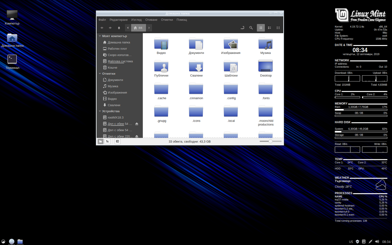


Re: Вашият десктоп
Код: Избери всички
anna@anarchy
 OS: anarchy
 Kernel: x86_64 Linux 5.2.13-arch1-1-ARCH
 Uptime: 1m
 Packages: Unknown
 Shell: zsh 5.7.1
 Resolution: 1366x768
 DE: XFCE4
 WM: Xfwm4
 WM Theme: Arc-Dark
 GTK Theme: Arc-Dark [GTK2]
 Icon Theme: Numix-Circle
 Font: Zekton 11
 CPU: Intel Celeron N2840 @ 2x 2.5823GHz
 GPU: i915drmfb
 RAM: 399MiB / 3829MiB

-
fifi_fifito
- Дарител
- Мнения: 3375
- Регистриран: пон фев 10, 2014 10:17
- Репутация: 18661
- пол: Мъж
- Местоположение: Търговище
Върни се в “Линукс - инсталация, настройки, проблеми”
Отиди на
- Въпроси, информация, новини
- ↳ Въпроси и проблеми, свързани с Kaminata.net
- ↳ Информация и новини
- ↳ Анкети
- ↳ Поздрави!!!
- Обсъждане
- ↳ Лафчета, лични проблеми, въпроси и още
- ↳ Любопитни новини
- ↳ Всичко за електронната цигара
- ↳ Поезия, лично и чуждо творчество!!!
- ↳ Миг в кадър
- ↳ Спам, спам, спам!!!
- Забавление и образование
- ↳ Музика
- ↳ Филми
- ↳ Книги
- ↳ Всякакви игри
- ↳ Форумни игри
- ↳ Реферати, есета, доклади, анализи
- ↳ Заявки за сваляне от Помагало
- ↳ Биология
- ↳ Български език
- ↳ География
- ↳ Геодезия, геология
- ↳ Геополитика
- ↳ Геофизика
- ↳ Европейска интеграция
- ↳ Екология
- ↳ Журналистика
- ↳ Информатика, IT, интернет
- ↳ Икономика
- ↳ История
- ↳ Литература
- ↳ Математика
- ↳ Медицина
- ↳ Механика
- ↳ Митология
- ↳ Педагогика
- ↳ Политология, политика
- ↳ Полиция, отбрана, национална сигурност
- ↳ Право
- ↳ Психология
- ↳ Радиоелектроника
- ↳ Религия
- ↳ Социология и социална политика
- ↳ Статистика
- ↳ Технически науки
- ↳ Транспорт
- ↳ Туризъм
- ↳ Физика и астрономия
- ↳ Физкултура и спорт
- ↳ Философия
- ↳ Химия
- ↳ Чужди езици
- ↳ Други
- Свободно време
- ↳ Свободно време
- ↳ Спорт
- ↳ Авто-мото
- ↳ Кулинария и рецепти
- ↳ Салати, предястия, аламинути
- ↳ Супи
- ↳ Ястия с месо
- ↳ Ястия с птиче месо
- ↳ Десерти и тестени ястия
- ↳ Ястия с риба
- ↳ Вегетариански ястия
- ↳ Пици
- ↳ Напитки и коктейли
- ↳ Други
- Компютри, интернет, програмиране
- ↳ Хардуер
- ↳ Интернет свят
- ↳ Софтуер
- ↳ Линукс - инсталация, настройки, проблеми
- Мобилен свят
- ↳ GSM новини, проблеми и въпроси
- ↳ Полезни нещица
- Много смях и закачки
- ↳ Вицове и смешни истории
- ↳ Забавни клипове и картинки
- ↳ Развлечения, тъпизми и всякакви подобни
- Архив
- ↳ Архив
- ↳ Софтуерни продукти
- ↳ Аудио и видео
- ↳ Изображения
- ↳ Текстови редактори
- ↳ Браузъри
- ↳ Windows инструменти
- ↳ Инсталация
- ↳ Антивирус
- ↳ Почистване и отпимизация
- ↳ Чертане и 3D моделиране
- ↳ Отдалечен достъп
- ↳ Плейъри
- ↳ Хард диск инструменти и бекъп
- ↳ CD/DVD/BlueRay инструменти
- ↳ FTP клиенти
- ↳ Интернет/Мрежи
- ↳ Програмиране
- ↳ Архивни мениджъри
- ↳ OCR - оптично разпознаване на текст
- ↳ Друг софтуер
- ↳ IT Новини